In early December 2020 I was able to finally take Amy Redmond’s Long Distance Letterpress: Type Forensics workshop about type identification and inventory, which she had adapted for an online class. Amy’s approach to type identification is very much about stewardship. She focused on honoring the legacy of the materials in use, taking the time to learn how and by whom the type was made, and holding only the faces you need in service of keeping more type in use. Add her technical prowess and experience as both a typographer and with the inventory of the Stern & Faye type collection, and a dynamic and useful workshop was born.
When we moved most of our type and equipment from Stumptown Printers into storage, we chose to save out three galley cabinets which house the bulk of our display type at 24pt. and above. One of my projects is to go back though and better organize and identify the contents. Many of the ornaments have never been proofed, and the typefaces are only partly catalogued. Additionally, many of the galleys have surface rust that needs to be removed. So, I used the momentum from this workshop to take some needed action.
First, clean. I needed to remove surface rust on our galleys before I could do any work of substance. I used Evapo-Rust (on recommendation from Ivan Snyder), soaking then rinsing the galleys. I treated enough that I could fill one column of our cabinet so that I could start to move type and concurrently soak the prior galley after a transition.
Second, organize. I separated the typefaces that have been stored together and labeled their galleys. In many cases we have half a galley of identified type and the other 50% unidentified. This step resulted in a lot of galleys labeled “unident” and “type to distribute”. I did keep small display fonts of multiple sizes together (i.e. 24pt. and 36 pt. of the same face) because we don’t have unlimited space. I also consolidated and retied a lot of the standing forms. With only three galley cabinets to deal with, I was able to alphabetize the identified typefaces (leaving gaps here and there to account for shuffling as new faces gain their identity), isolate the galleys that needed attention, and set up a section for current forms in use.
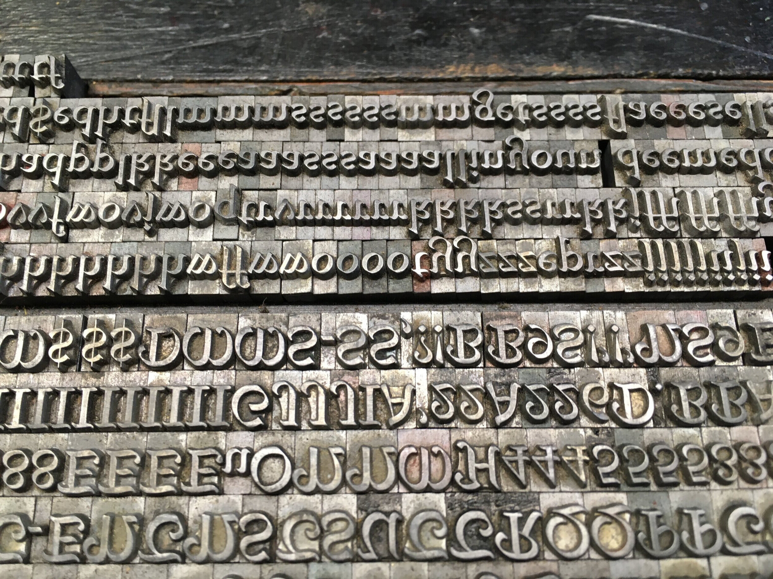
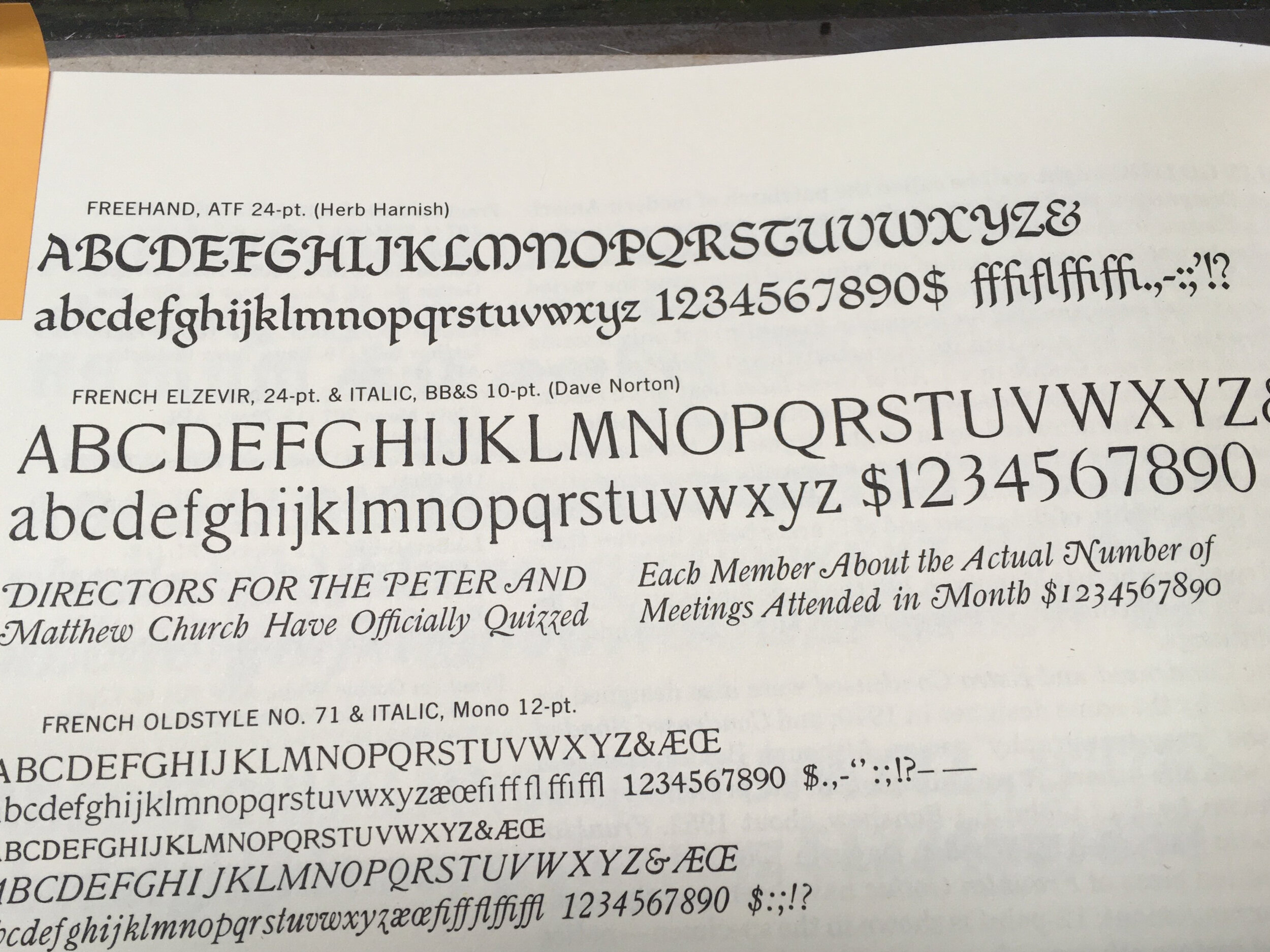
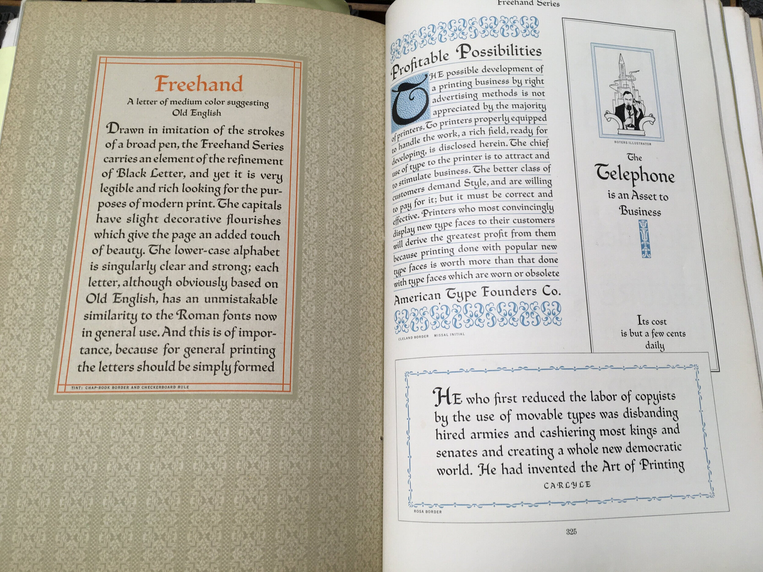
Third, identify. “Unident” galley number one contained a calligraphic face that I am embarrassed to admit sat on the same galley for over 20 years. It was mixed with a couple sizes of Old English and I am afraid we didn’t poke farther back than that in all the years that we pulled type from this particular location. I selected a couple characters and referenced our copy of Mac McGrew’s American Metal Typefaces of the Twentieth Century. It’s a pretty distinct face, so I was quickly able to identify “Freehand”, designed for American Type Founders by Morris Benton in 1917, and then cross-reference it in the ATF Specimen Book. As a child who spent hours practicing calligraphic standards with different width pen nibs, and a fan of the typefaces designed by Eric Gill and Jim Rimmer, I was pleasantly surprised to discover this hidden treasure. And, despite that appreciation, I hardly know what to do with typefaces so closely related to hand lettering. Luckily, I did have a very short poem by W.S. Merwin waiting to be set in type and this face was appropriate to that use.
The next step is to document this particular typeface by pulling a proof and counting characters using the specimen ID sheets that I adapted from ones that Armina Ghazaran (Type & Press) uses at the Museum of Industry in Ghent, Belgium. These are stored in a binder in our shop space and include location and name, in addition to the information about provenance. My goal is then to enter the data from these physical sheets into the spreadsheet template that Amy Redmond (Amada Press) developed in order to have a document that can easily be shared with others.


