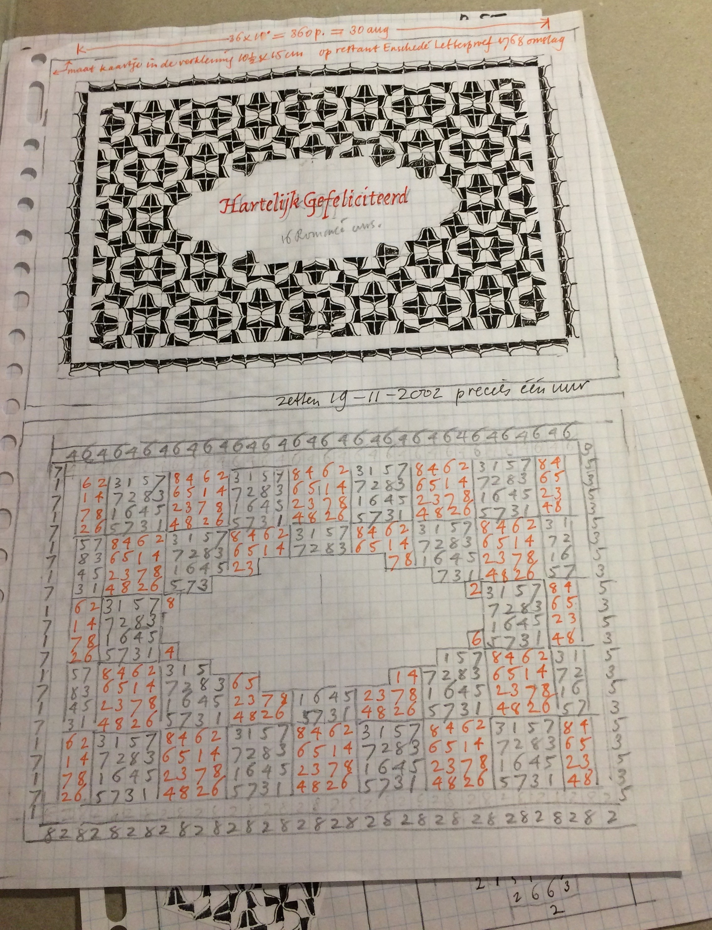
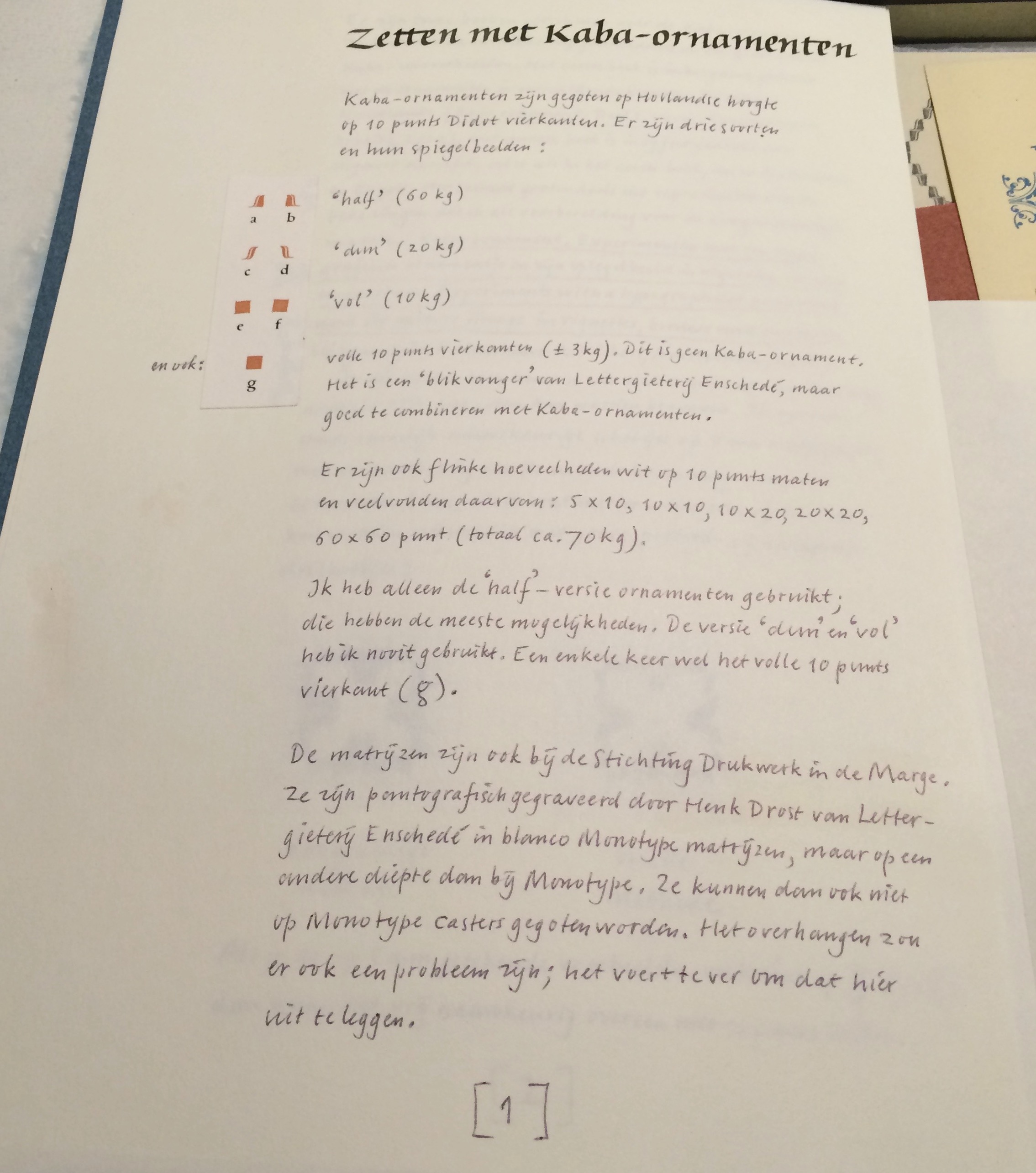
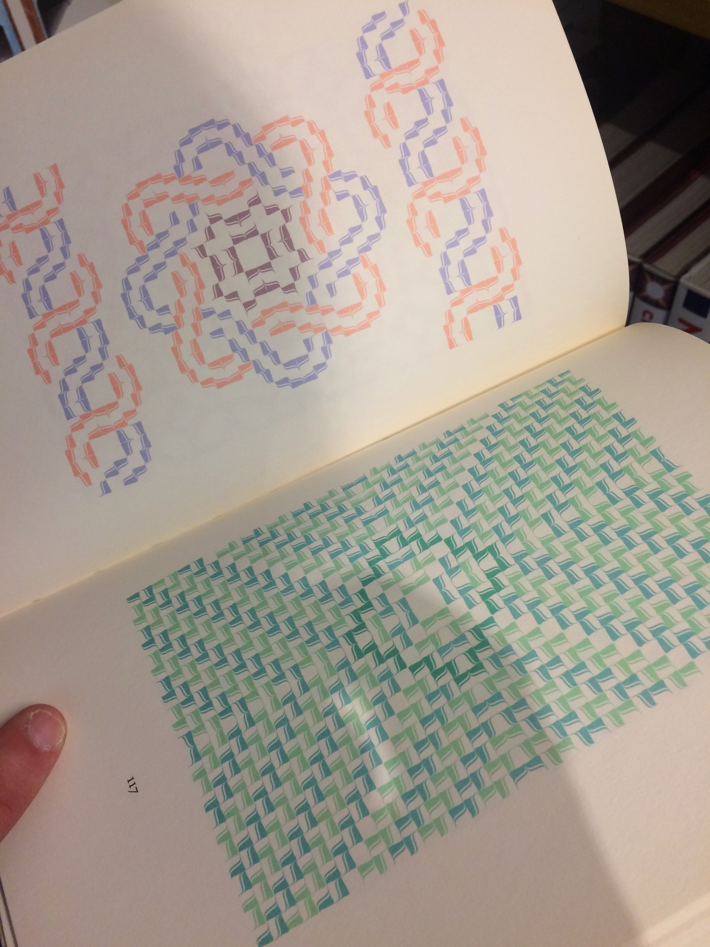
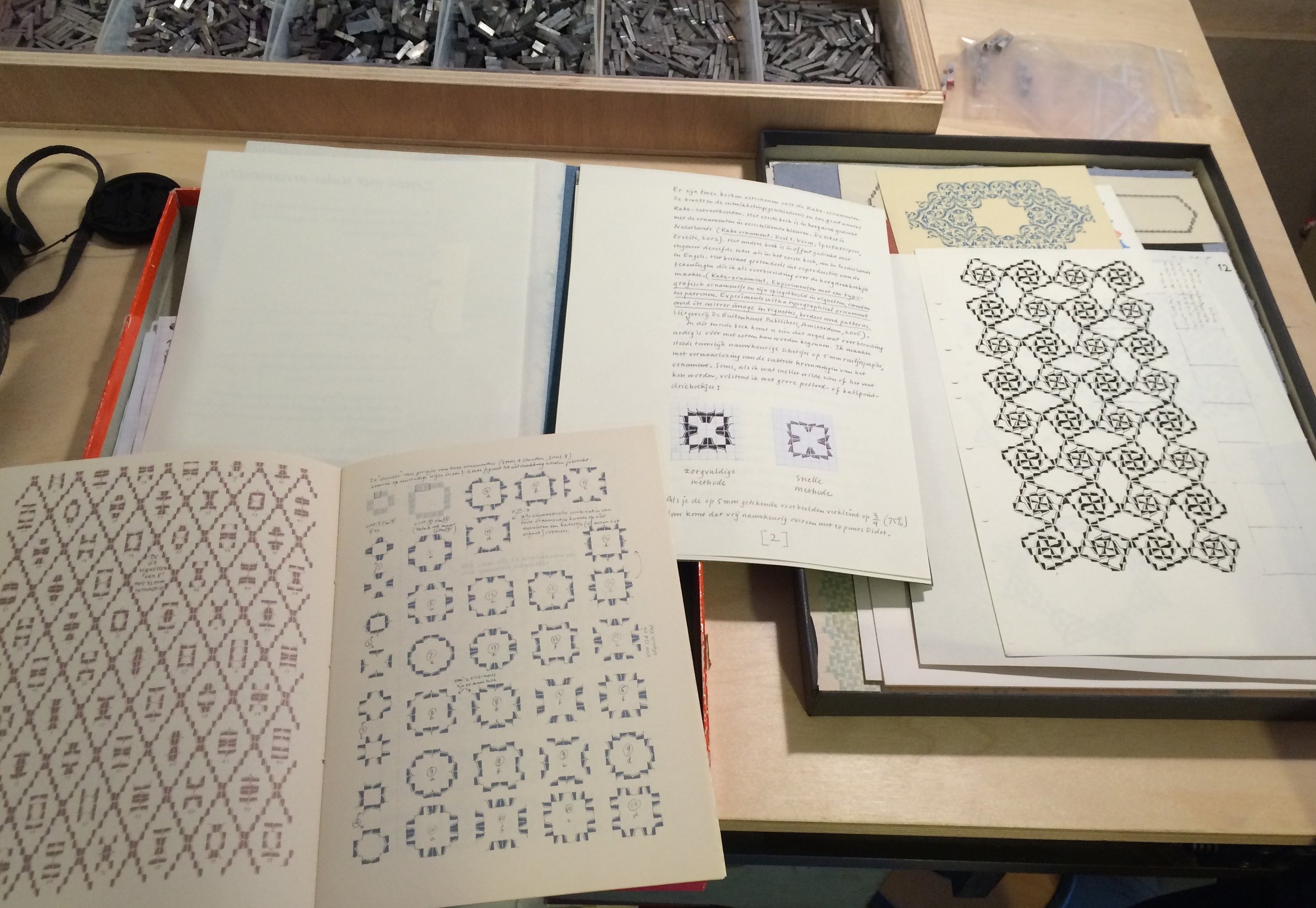
A few years ago Brian and I made a trip to Amsterdam to see a friend and were also able to visit Thomas Gravemaker at Letterpress Amsterdam. The tour of his building revealed a lovely old canal house with an interesting history, many winding staircases & sets of doors. Thomas has a few hundred square meters in the front of the building, where he takes on commission printing and also teaches workshops. One recent workshop focused on Bram de Does’ Kaba ornament, and he pulled out examples of student prints along with the actual metal casting. As a part of the Drukwerk in de Marge organization, Thomas has possession of de Does’ process sketches for patterns and layouts with the Kaba ornament. I was captivated by what he showed us and set out to learn a little more about the story behind it.
Kaba was initially designed as a 6 piece ornament with 3 positive figures and 3 negative ones. Ultimately, de Does had just four pieces cast, and then discarded two of those as failures, leaving him with only the “a” and “b” designs. For nearly 30 years, Bram de Does worked on his Kaba design, sketching for a half hour every morning, playing with patterns, borders & vignettes. In the end, he became more fascinated with the possibilities of combinations than the ornament itself. Not only was de Does working with the idea of mathematical symmetry groups, he was also building on his method for composition on the Monophoto typesetting machine (circa 1970). He devised a key for setting the ornaments, with each possible position numbered 1 to 8. In this way, he could build a grid for each pattern or border and follow that guide when setting the ornaments themselves.
Bram de Does was employed at Johhannes Enschedé printing office in Haarlem, The Netherlands for much of his career, repeatedly taking a break to sustenance farm, and then returning to print. Beginning in 1958, de Does worked under Sem Hartz (Art Director) and the noted type designer, Jan Van Krimpen, and is probably best known for his work on the volume entitled Typefoundries of the Netherlands produced in 1978 (the last book at Enschedé printed entirely in letterpress). He continued to work at Enschedé through the transition from metal to cold type, and distinguished himself by designing one of the first company faces made specifically for the new technology of phototypesetting machines. Trinité (1979-1982) is a humanist serif face, created with three variants in length of the ascenders and descenders (hence the name).
de Does studied a number of solutions for harmony on the printed page and decided that “systematic sloppiness” was key, to show the influence of the hand, the absence of straight lines, and give a sense of what he called “functional swing” to the letterform. In 1989, de Does was commissioned once again to design a face for phototype, this time for Van Dale’s Dictionary of the Dutch Language. The result was Lexicon, released in 1992, a face meant to be legible at a very small size, which was issued in two versions.
Throughout his working years, Bram de Does continued his designs for the Kaba ornament as he sat at his kitchen table each morning, planning for what he thought would be three volumes he would print at his own private press, Spectatorpers. Inspired by the design of the Monotype Recorder, Max Cafisch’s writings, and the Granjon ornaments, he worked to create adornment based on the square unit (Ka’ba is the arabic word for cube) that would have some of the same humanistic harmony as Trinité. An early version was engraved and test cast by Henk Drost at Enschedé, but proved to be too tricky to set with the corner of the ornament coming right up to the edge of the type body. Overnight, de Does redesigned Kaba so that the positive didn’t come all the way to the edge, and had a slight calligraphic curve to the point. Ultimately this version was cast in a small font.
In 2012 Bram de Does finished his first book using Kaba, 56 pages of hand set type and ornaments printed in five colors, 90 forms, edition of 240. We set off to visit the Special Collections at the University of Amsterdam to find this book, and hoped to delve farther into the archives and working papers of de Does. We only got as far as the bookstore. They had copies of both his handset limited edition letterpress printed books and a larger edition offset litho book published by the University Press entitled The Kaba ornament in vignettes borders and patterns, which shows sketches, pattern development, and reproductions of letterpress work. It also contains essays by Bram de Does illuminating his approach to this particular ornament design, a large part of which is based on mathematical “symmetry groups” (particularly translation, reflection, rotation, and glide reflection as defined by E.H. Lockwood and R.H. Macmillan in Geometric Symmetry). This interest in patterning seemed to engross de Does until the end of his life in 2015. He never stopped exploring the overlap in artistic and scientific symmetry through sketches and writing.
Photos: (Above) Thomas Gravemaker at Letterpress Amsterdam holding Kaba ornament A and B; (Below) sketches and layout grid for book design, handwritten notes on ornament design, letterpress book pages using Kaba printed at Spectatorpers, Kaba ornament design archive and cast pieces.


