

This Coronavirus situation has us all scrambling to figure out not only our new work situations, but also our creative connections. One of the pieces of printing that I really like is the chance to visit others practicing the craft in their studios, commercial shops, classrooms, working museums, community print shops, or kitchen table press rooms. It looks like that’s not going to be possible for a while. Luckily, a small team has put together a series of online studio visits called “United in Isolation”. On Saturdays they host 1-4 printers from around the world, each talking for about 20 minutes. You get a quick tour of the printer’s workspaces and equipment, and an opportunity to see some of their work they are creating. It’s a chance to “visit” people involved in printing all over the world!
It’s on Facebook

OHS Library Move (Part One) Complete
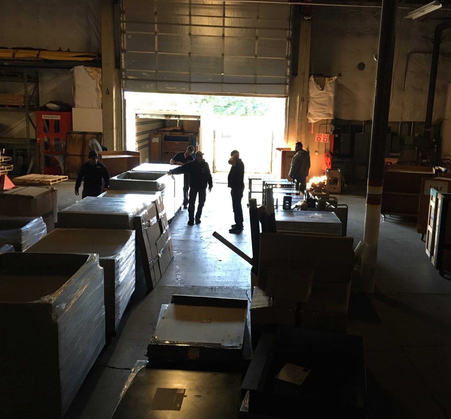
For the past nine months I have been working part-time at the Oregon Historical Society on the temporary Research Library move, consolidating the collections at an offsite facility while the downtown location is completely remodeled. From June to September, I primarily worked on a small team under Archivist Valerie Harris, assisting with inventory shelf reads, rehousing materials and consolidating collections to create more space for the interim. Beginning in October of 2019, I was promoted into the role of Move Coordinator, working directly with Collections Manager Dana Miller to assist with logistics of the move, which happened in two stages. This involved mapping new locations for collections, offices, and the public research room; oversight of movers, flat file installation and shelving construction; deaccessioning out of scope collections; moving excessively large or fragile books, maps, documents and photographs by hand; more shelf reading and inventory work as collections were combined in a single location; and general communications with the moving team. While much of the work drew on skills I’d developed through decades of moving letterpress printing equipment and type collections, as well as running a small business, it was also a crash course in Library and Archive standard procedures. I’m thankful for the generosity of everyone I have worked with for sharing their knowledge with me through the process, and to the entire library staff for the teamwork involved in pulling off such an undertaking. Writing now, in mid-March, all the collections and library staff offices have been safely relocated offsite and construction on the 4th floor at 1200 SW Park Ave commenced. We are also all suddenly at home for the foreseeable future, as the COVID-19 State Stay-at-Home orders are in effect and the timeline for this pandemic are currently unknown. The final documentation for this portion of the initiative and planning for the return downtown in late 2020 may all happen remotely! Stay up to date on the Oregon Historical Society Research Library renovation and reopening on their website.

CBAA 2020 Conference
In the first days of January 2020 I attended the College Book Arts Association (CBAA) biennial conference, held this time in New Orleans, Louisiana. Though I have been peripheral to the activities of this association through the local print/book arts community, I’ve never attended a conference. The closing of Oregon College of Art and Crafts, and the eminent closure of other small liberal arts schools with book arts programs contributed to a sense of urgency on my part. In addition, the programming of the C.C. Stern Type Foundry is intertwined with college level curriculums.
The 2020 conference was entitled “Intersections” and focused on the possibilities for increasing access to contemporary book arts education. This was manifest in the themes of many presentations — social practice using book arts, making private collections public, zines in the world of book arts, book arts education in rural areas, cultural heritage publishing, developing a context for inclusivity. I found the abstracts often intriguing, but I found myself wishing that the presentations themselves reflected an enthusiasm I assume most educators have in the classroom, rather than the reading of an academic paper.
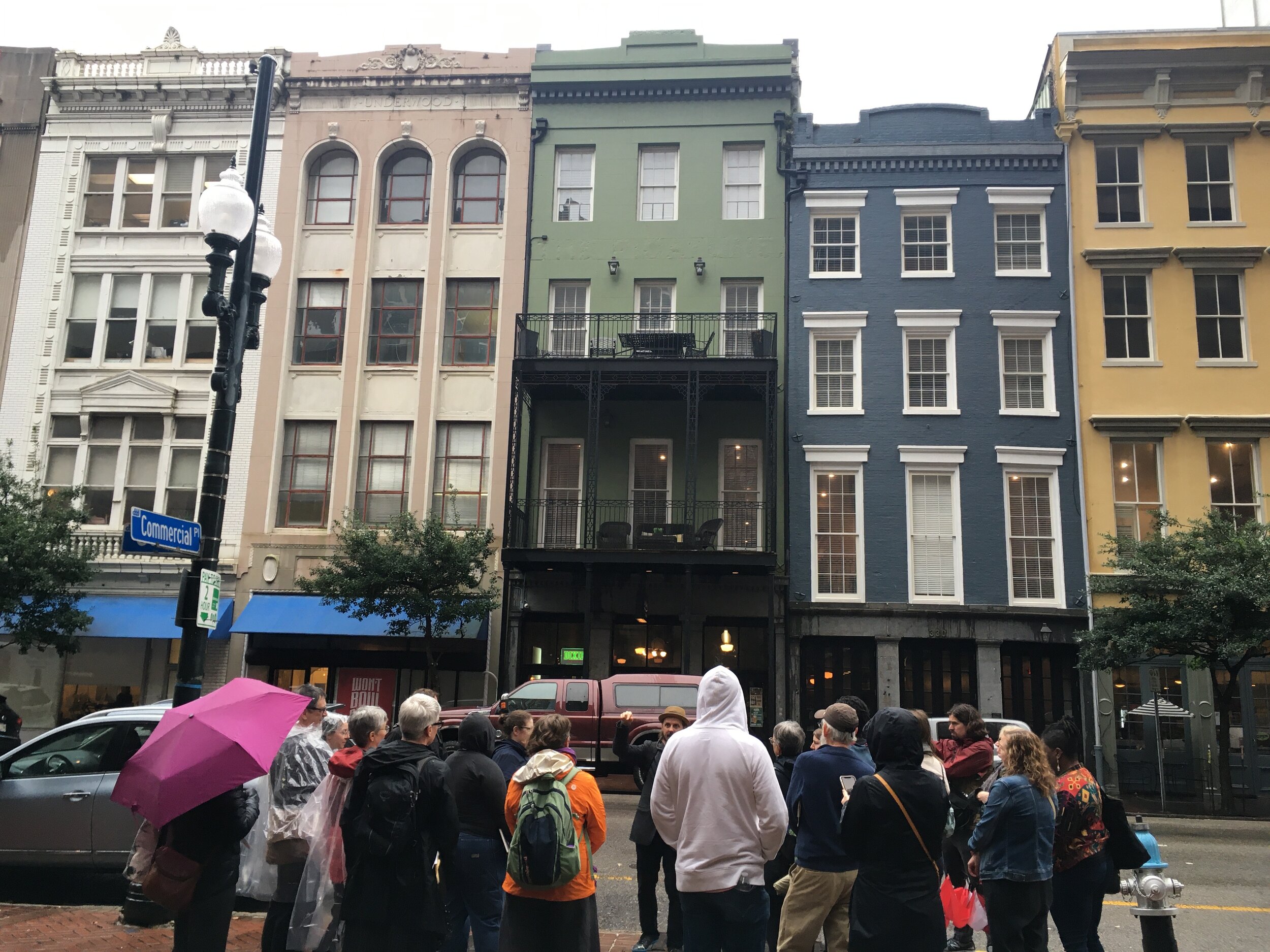
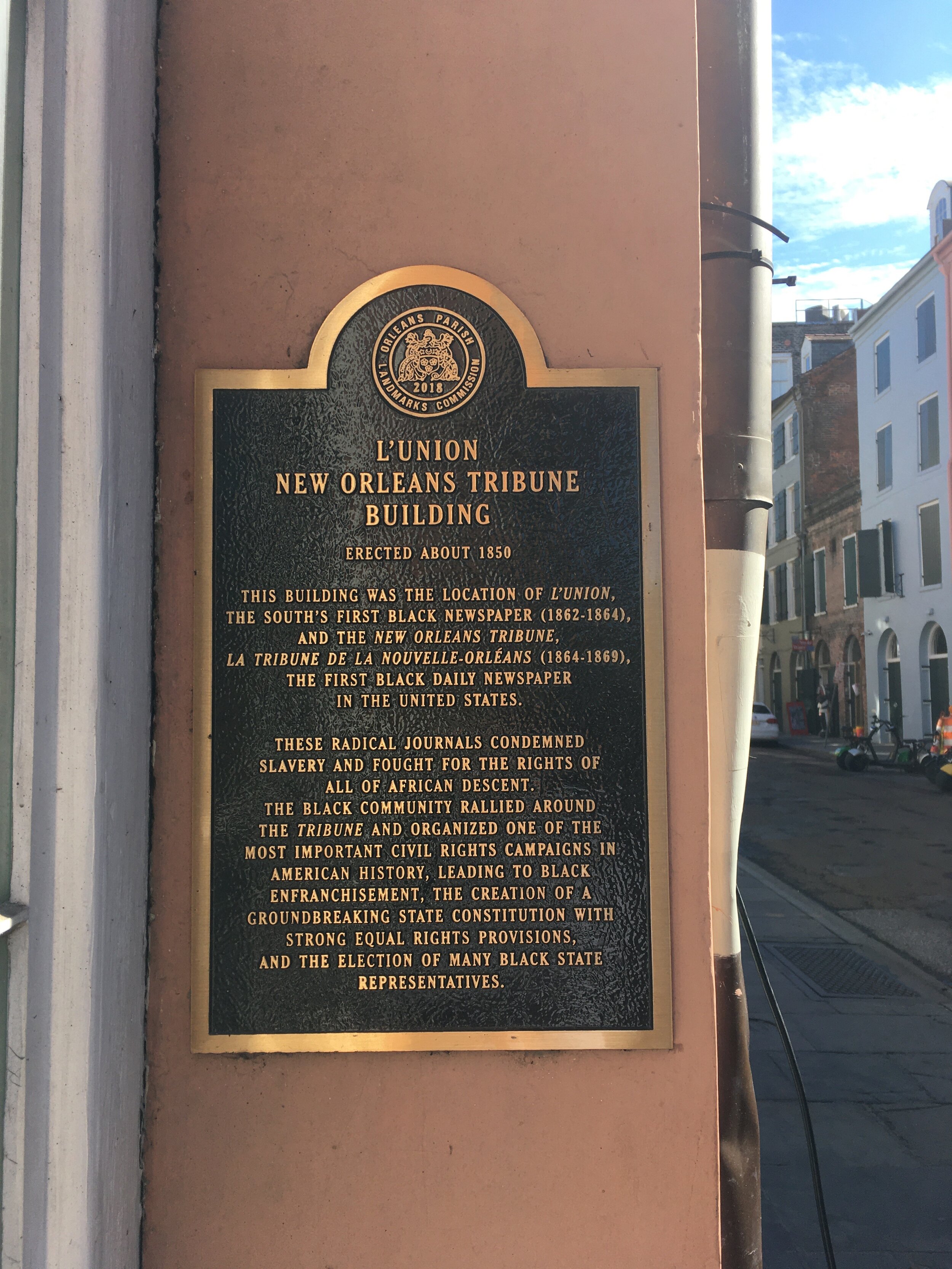
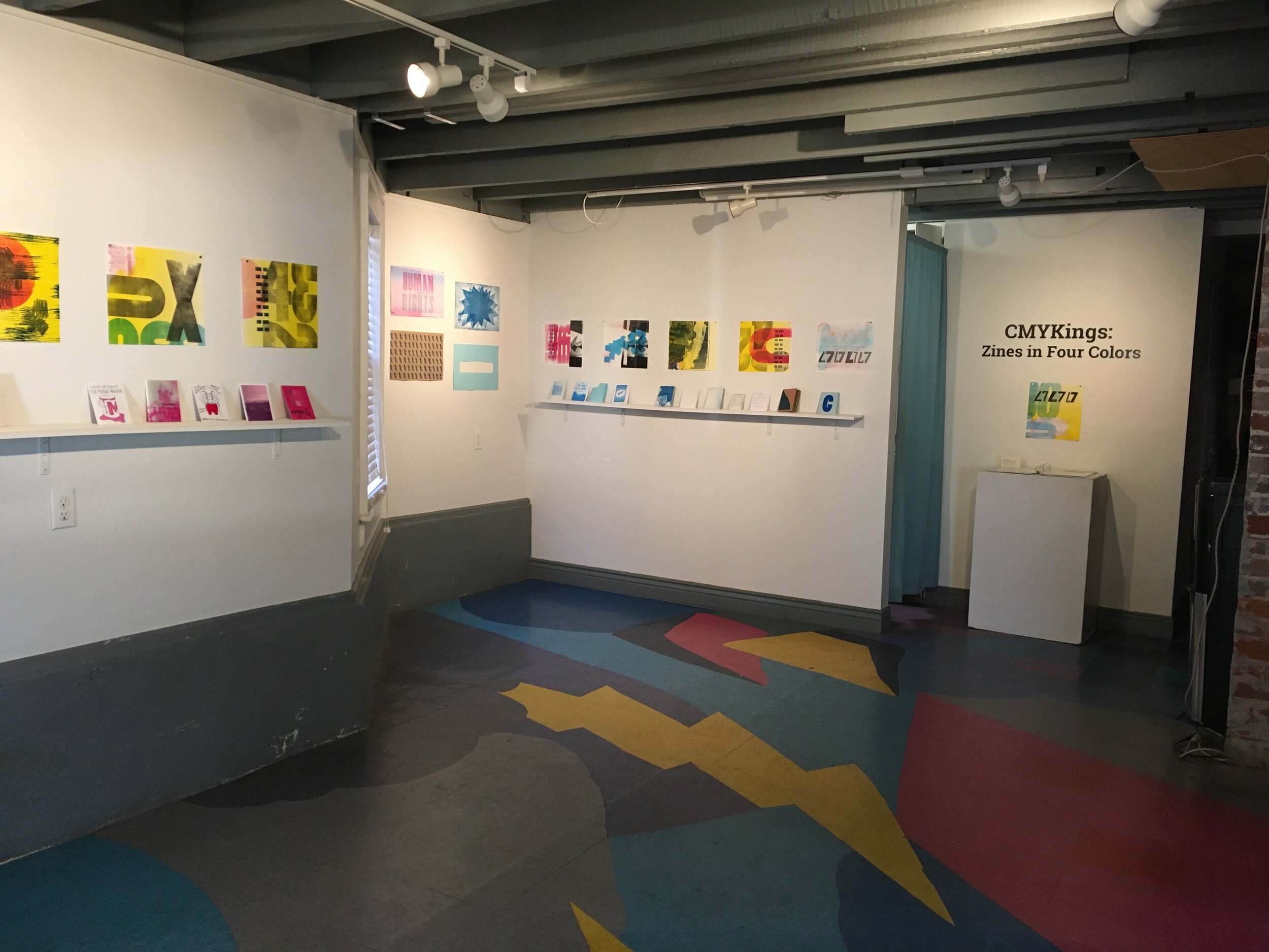
Kudos to the organizers for including opportunities and “prompts” to encourage exchange in an ongoing manner, for showcasing member book work in an exhibit that powerfully expressed the theme of the conference, and for reaching into their home communities to offer resources and connections beyond the conference grounds. Though I missed tours held on the first day of the conference, I heard great things about the Amistad Research Center at Tulane and also the Paper Machine workspace. I did make it out on a very rainy tour walking tour led by NOLA DNA, focused on early print houses of New Orleans, and to see the CMYK Kings zine exhibit at Antennae Gallery.
Opening remarks were by Rachel Bruenlin and Bruce Barnes of the Neighborhood Story Project, a nonprofit collaborative ethnography organization that works in partnership with the University of New Orleans. They gave an overview of the community-based publishing projects they have engaged in, including documenting regional music and storytelling traditions in their most recent book Le Ker Creole (The Creole Heart): Creole Compositions and Stories from Louisiana.
The keynote address by Rebecca Snedecker was also marvelous, and resonant of the theme as she talked about the process of compiling Unfathomable City: A New Orleans Atlas. She took the audience on a visual journey of discovery in her home town, illuminating how that ultimately led her to a greater sense of understanding of the history and culture of New Orleans, and a deeper connection to her own place.
Of course the chance to again wander the city of New Orleans, to experience the unique culture and landscape of that place, to join with strangers and cross paths with old friends in the middle of the streets, to see how a city shifts and responds to each generation of challenges … those intersections do resonate as especially powerful in the present time.

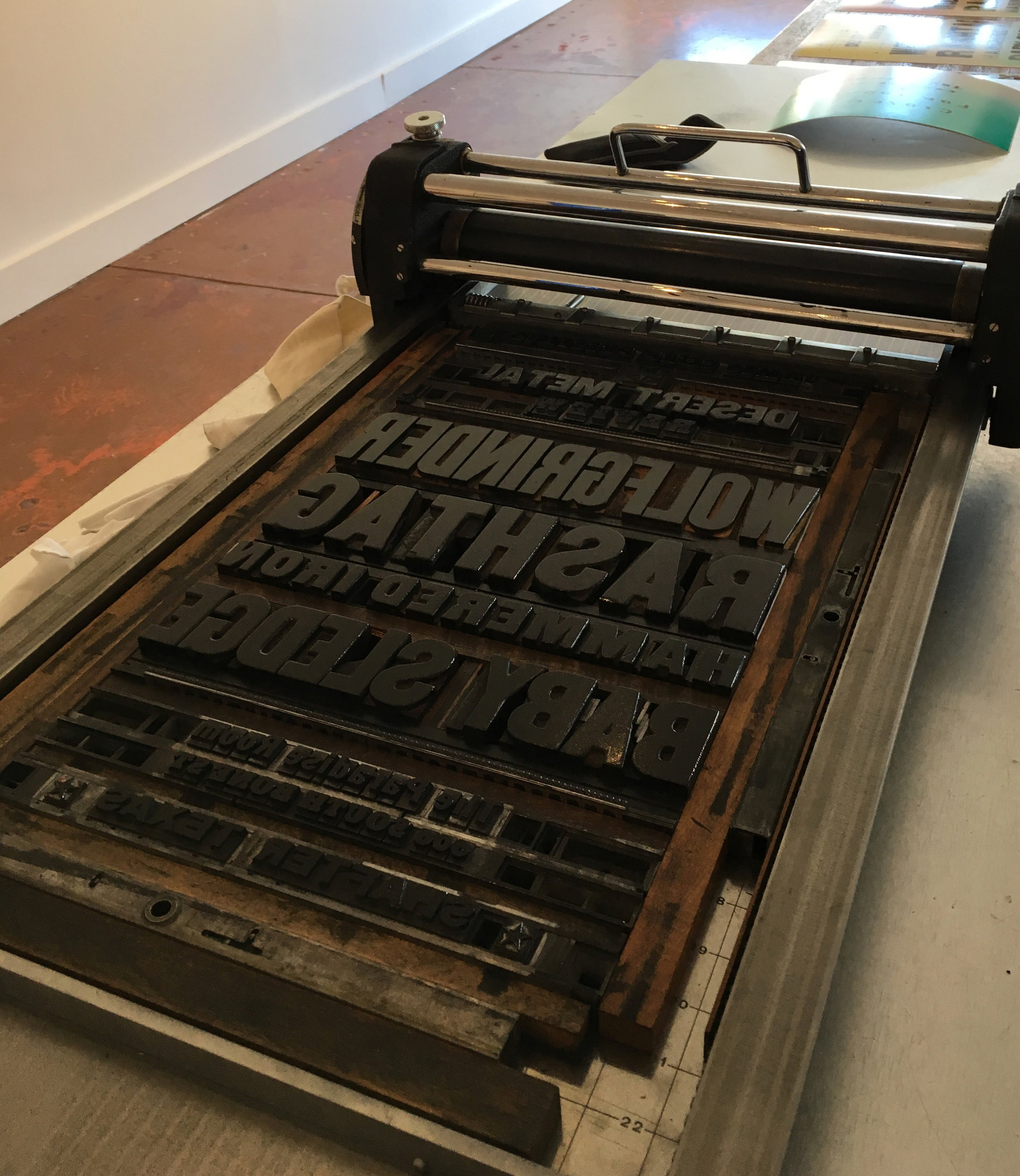
Marfa Community Print Keepsake
Letterpress, metal type
8” x 10”
This keepsake print was made in collaboration with Brian Scott Bagdonas for the the launch of Marfa Community Print in 2020. Board members were asked to contribute a print that expressed the qualities that make Marfa, Texas a special place to create art in community.
Linotype 14 point Intertype Bodoni Book 961 cast at the C.C. Stern Type Foundry. Color tints printed from litho blankets. Letterpress printed on Via Warm White in four colors.


Ham at 20
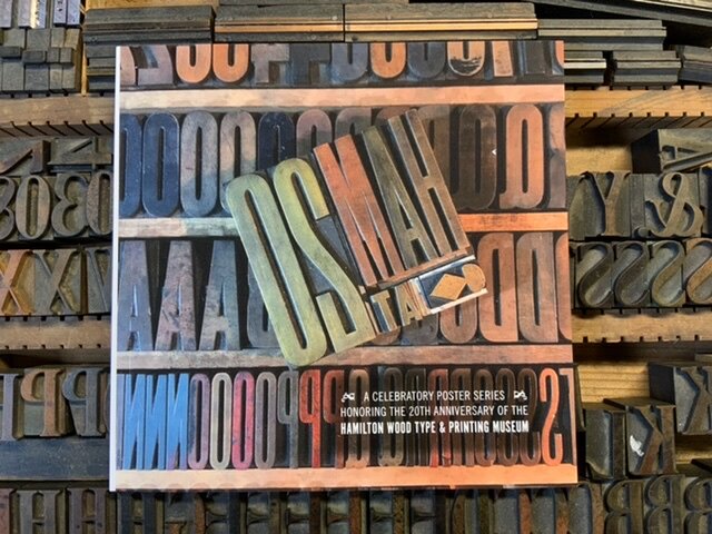
The Ham at 20 poster project celebrates the 20th anniversary of Hamilton Wood Type and Printing Museum in Two Rivers, Wisconsin, and was coordinated by Jennifer Farrell of Starshaped Press. This collaborative venture featured a poster (or three) released each month of 2019, resulting in a collection of 28 posters by end of year. You can see my poster, designed and printed in collaboration with Brian Bagdonas, in Print Work. The edition was 50 for each poster, 25 of which were reserved for complete portfolios. You can purchase individual posters, year-end portfolios, and a catalog documenting the project from the Hamilton website.


C.C. Stern Type Foundry Rent Increase
The end of another year has crept up to the finish line, and the C.C. Stern Type Foundry is faced with a major rent increase starting January 1st, 2020. We have been so thankful for all the support we’ve received, and the low-cost programming we have been able to offer over the last decade. The Type Foundry is all-volunteer run, and depends on individual donations to fund the operations of the working museum and related educational activities. Please consider making an end of year donation to this vital part of our print community.

Announcing ... Marfa Community Print!
I’m very pleased to be involved in the formation of another community-based art space, this time in Marfa, Texas. The brain-child of Laura Thoms, Marfa Community Print (a non-profit organization) will provide much needed affordable access to space to create artwork, offer educational workshops, and help to bolster the creative community in this remote area of the country. She has planned a vibrant roster of visiting printers and artists for the year ahead, with most programming to commence in Spring 2020 when work on the space is complete and equipment can be moved out of storage. The organization is actively fundraising now, and your support is needed!


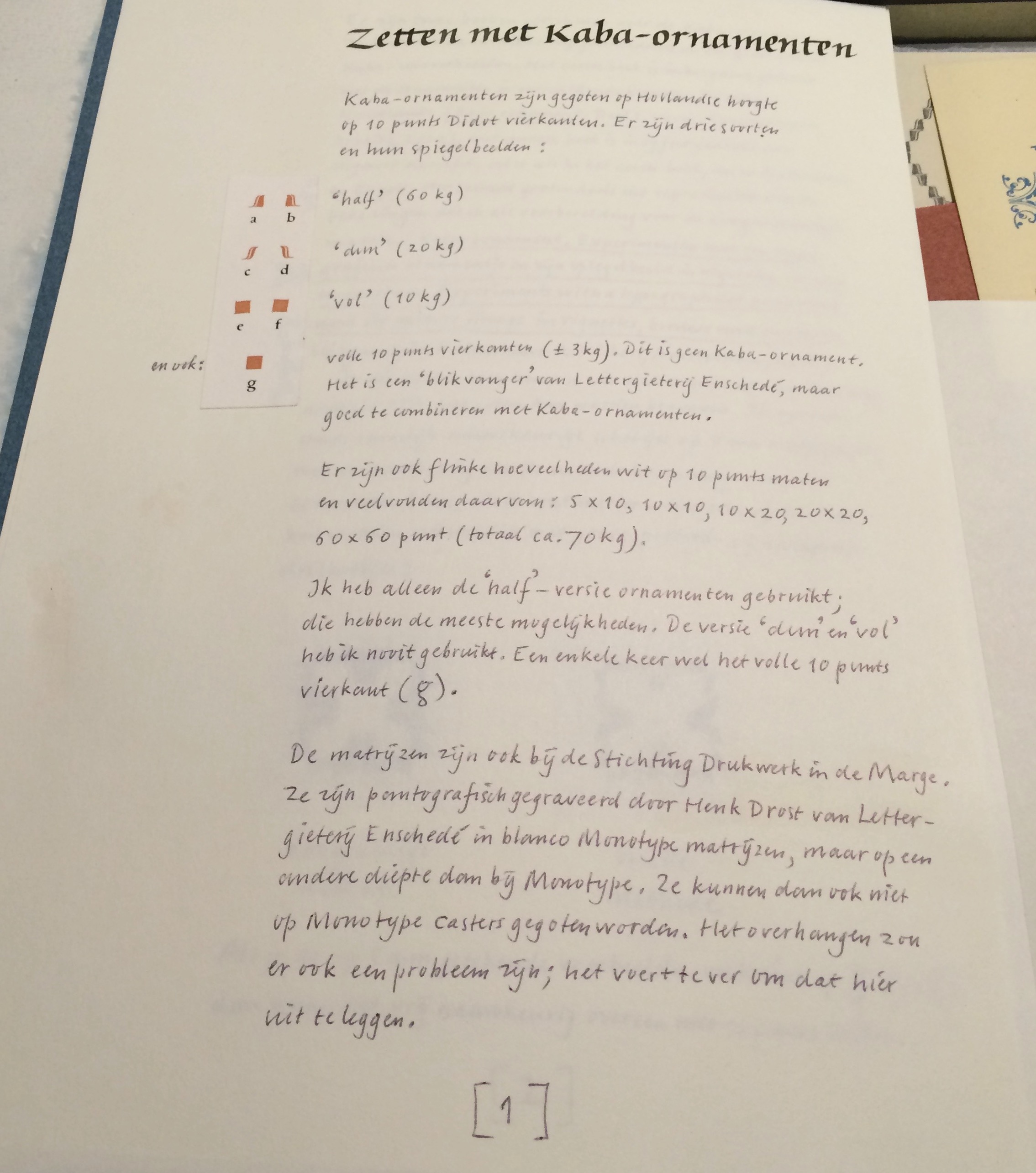
Kaba
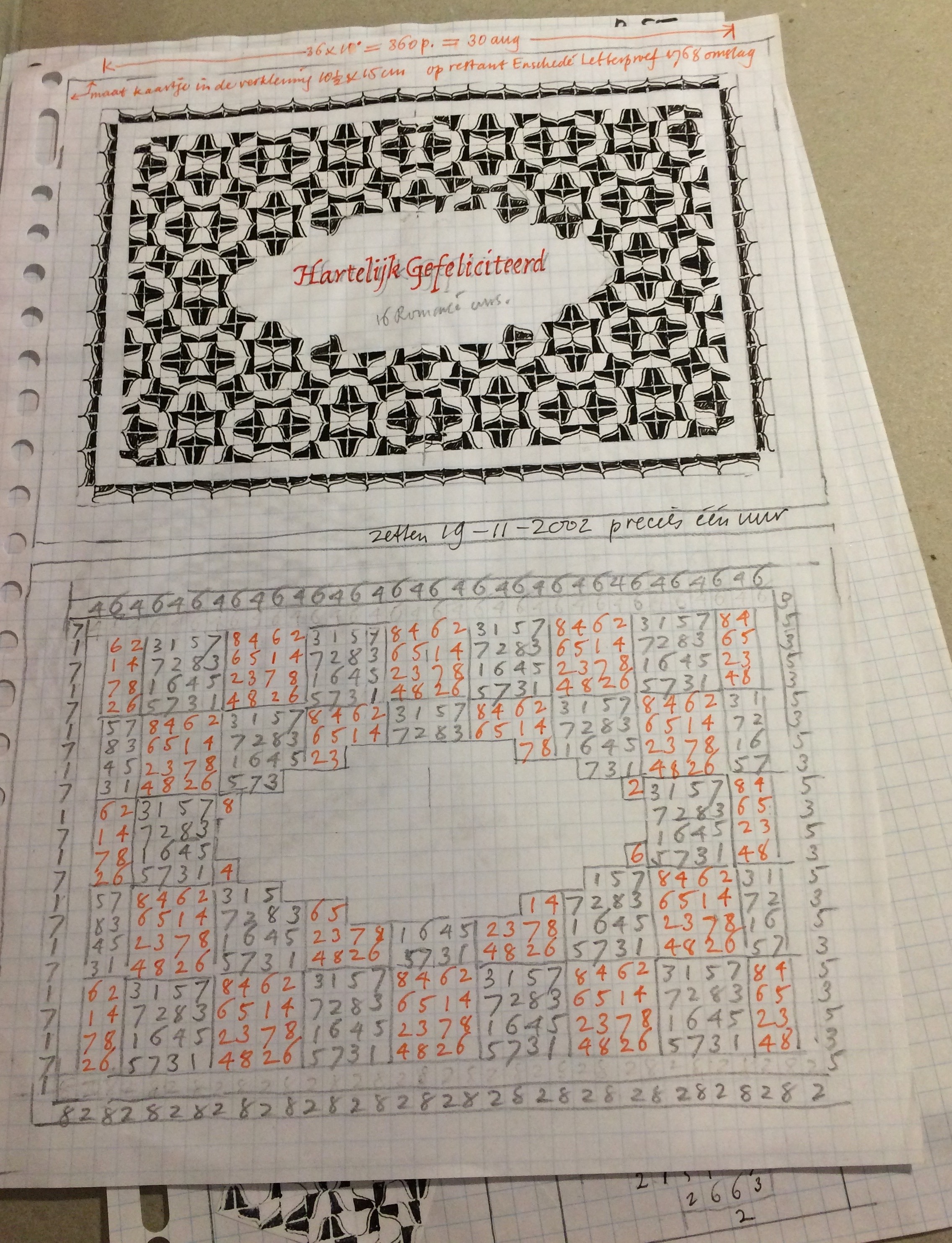
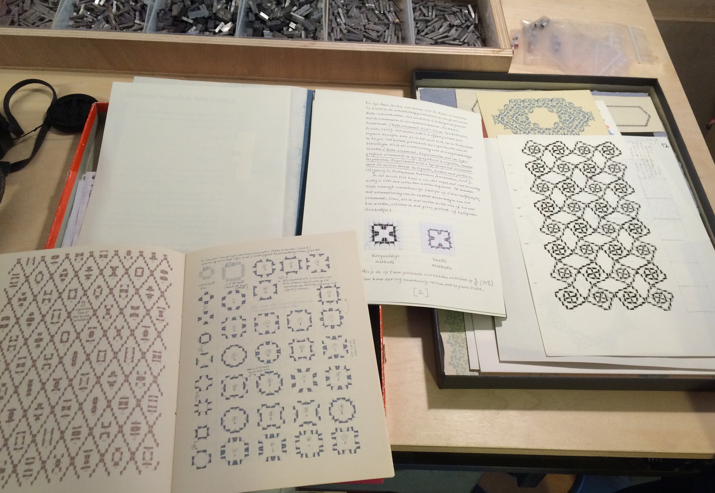
A few years ago Brian and I made a trip to Amsterdam to see a friend and were also able to visit Thomas Gravemaker at Letterpress Amsterdam. The tour of his building revealed a lovely old canal house with an interesting history, many winding staircases & sets of doors. Thomas has a few hundred square meters in the front of the building, where he takes on commission printing and also teaches workshops. One recent workshop focused on Bram de Does’ Kaba ornament, and he pulled out examples of student prints along with the actual metal casting. As a part of the Drukwerk in de Marge organization, Thomas has possession of de Does’ process sketches for patterns and layouts with the Kaba ornament. I was captivated by what he showed us and set out to learn a little more about the story behind it.
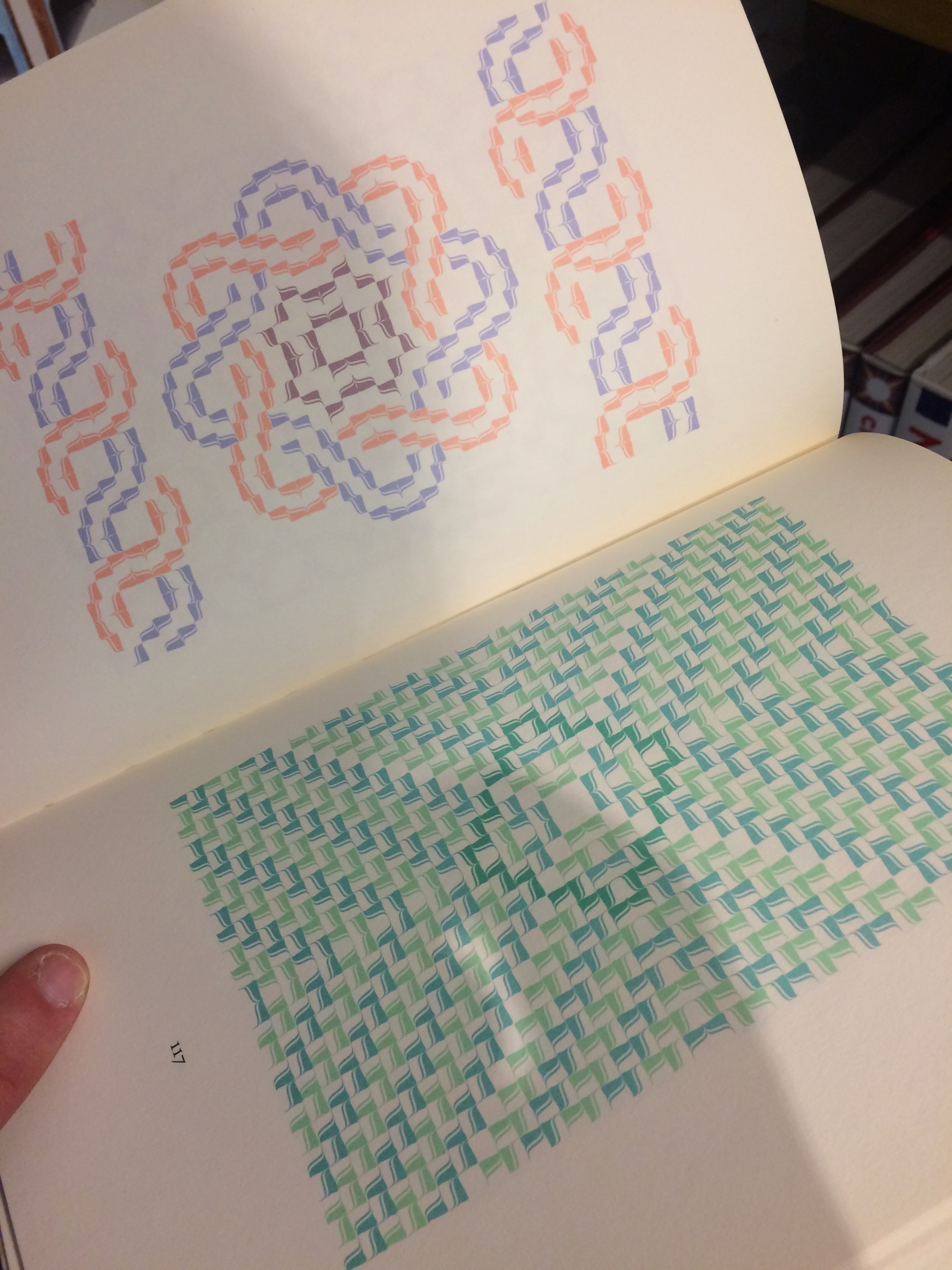
Kaba was initially designed as a 6 piece ornament with 3 positive figures and 3 negative ones. Ultimately, de Does had just four pieces cast, and then discarded two of those as failures, leaving him with only the “a” and “b” designs. For nearly 30 years, Bram de Does worked on his Kaba design, sketching for a half hour every morning, playing with patterns, borders & vignettes. In the end, he became more fascinated with the possibilities of combinations than the ornament itself. Not only was de Does working with the idea of mathematical symmetry groups, he was also building on his method for composition on the Monophoto typesetting machine (circa 1970). He devised a key for setting the ornaments, with each possible position numbered 1 to 8. In this way, he could build a grid for each pattern or border and follow that guide when setting the ornaments themselves.
Bram de Does was employed at Johhannes Enschedé printing office in Haarlem, The Netherlands for much of his career, repeatedly taking a break to sustenance farm, and then returning to print. Beginning in 1958, de Does worked under Sem Hartz (Art Director) and the noted type designer, Jan Van Krimpen, and is probably best known for his work on the volume entitled Typefoundries of the Netherlands produced in 1978 (the last book at Enschedé printed entirely in letterpress). He continued to work at Enschedé through the transition from metal to cold type, and distinguished himself by designing one of the first company faces made specifically for the new technology of phototypesetting machines. Trinité (1979-1982) is a humanist serif face, created with three variants in length of the ascenders and descenders (hence the name).
de Does studied a number of solutions for harmony on the printed page and decided that “systematic sloppiness” was key, to show the influence of the hand, the absence of straight lines, and give a sense of what he called “functional swing” to the letterform. In 1989, de Does was commissioned once again to design a face for phototype, this time for Van Dale’s Dictionary of the Dutch Language. The result was Lexicon, released in 1992, a face meant to be legible at a very small size, which was issued in two versions.
Throughout his working years, Bram de Does continued his designs for the Kaba ornament as he sat at his kitchen table each morning, planning for what he thought would be three volumes he would print at his own private press, Spectatorpers. Inspired by the design of the Monotype Recorder, Max Cafisch’s writings, and the Granjon ornaments, he worked to create adornment based on the square unit (Ka’ba is the arabic word for cube) that would have some of the same humanistic harmony as Trinité. An early version was engraved and test cast by Henk Drost at Enschedé, but proved to be too tricky to set with the corner of the ornament coming right up to the edge of the type body. Overnight, de Does redesigned Kaba so that the positive didn’t come all the way to the edge, and had a slight calligraphic curve to the point. Ultimately this version was cast in a small font.
In 2012 Bram de Does finished his first book using Kaba, 56 pages of hand set type and ornaments printed in five colors, 90 forms, edition of 240. We set off to visit the Special Collections at the University of Amsterdam to find this book, and hoped to delve farther into the archives and working papers of de Does. We only got as far as the bookstore. They had copies of both his handset limited edition letterpress printed books and a larger edition offset litho book published by the University Press entitled The Kaba ornament in vignettes borders and patterns, which shows sketches, pattern development, and reproductions of letterpress work. It also contains essays by Bram de Does illuminating his approach to this particular ornament design, a large part of which is based on mathematical “symmetry groups” (particularly translation, reflection, rotation, and glide reflection as defined by E.H. Lockwood and R.H. Macmillan in Geometric Symmetry). This interest in patterning seemed to engross de Does until the end of his life in 2015. He never stopped exploring the overlap in artistic and scientific symmetry through sketches and writing.
Photos: (Above) Thomas Gravemaker at Letterpress Amsterdam holding Kaba ornament A and B; (Below) sketches and layout grid for book design, handwritten notes on ornament design, letterpress book pages using Kaba printed at Spectatorpers, Kaba ornament design archive and cast pieces.

moving along
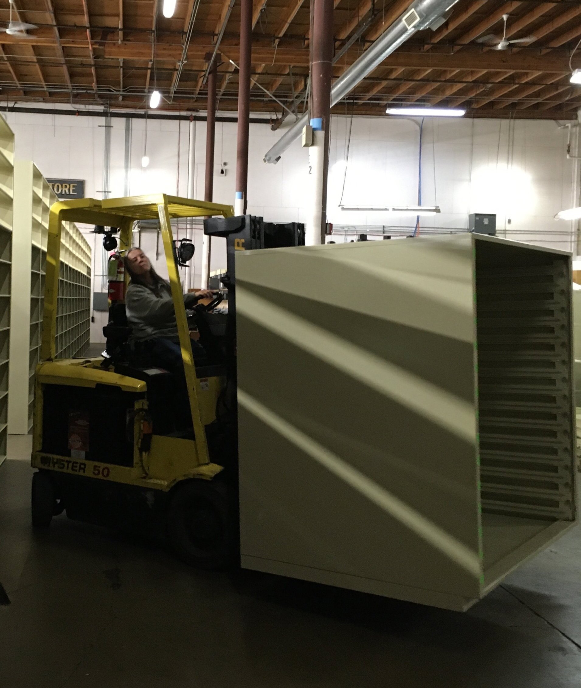
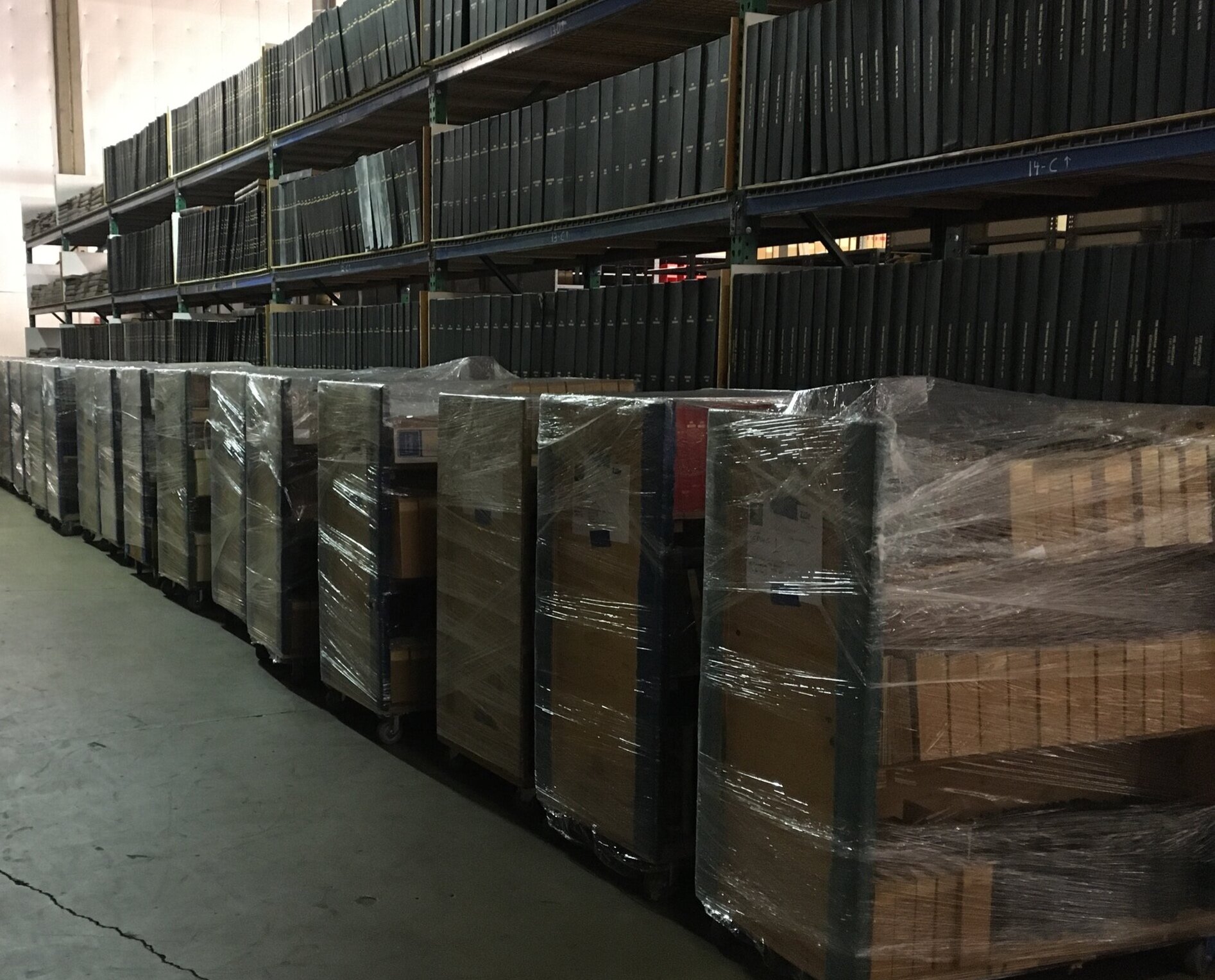
In mid-June I started a new part-time, entry-level position at the Oregon Historical Society as an archivist assistant, working on a temporary project to move the research library. I’m lucky enough to be working under experienced archivists and librarians, learning a bit more about the field and about standard procedures. The materials in the library will be relocated to another facility while the library is renovated, but most materials will still be accessible. This means we are methodically combing through the existing collections and making sure they are properly housed and catalogued in order to move them. New shelving units will be ordered for storage off-site, so there is plenty of measuring and calculating of linear feet required to shelf the materials being moved. Of course, there are many diagrams on graph paper and a multitude of spreadsheets to coordinate all this. But there is also a lot of time handling paper and books and getting a hands-on experience of the Oregon Historical Society’s library collection. A few of my favorite finds so far are pictured.

Los Ultimos poster hanging on the wall in the new studio
Los Ultimos (Endless Letterpress)
This documentary about the past, present and future of letterpress in Argentina is currently circulating the world at public screenings, and showed to a small audience in Portland this past month. Filmmakers Pablo Pivetta and Nicolas Rodriguez Fuchs were in attendance, and patiently answered our questions about the evolution of print in Buenos Aires and surrounding areas. Shot over a period of 6 years, the story weaves together those who are forced to give up the trade and a small group of people who are just discovering the wonders of printing from hand set type. Perhaps this film will help shed light on the interest of newer generations in letterpress printing, and to connect traditional practitioners in Argentina with those eager to learn.

The first press into the storage container ….
Endings and beginnings ...
As of February 2019, we have ceased the commercial operations of Stumptown Printers Worker Cooperative, so for the past couple months I’ve been reassessing how I spend my working hours. For the last 20 years my identity has been wrapped up in the collective operations of our business and the print trade, with all other activities playing second fiddle. While I don’t have the means to take a sabbatical from work altogether, I am able to refocus the work that I’m doing.
The majority of our printing equipment is in storage, but we set up two presses in our new garage studio and started in printing right away. Despite the fact that we’re not completely unpacked yet, it promises to be an efficient little space (180 square feet!) once we’ve organized all the tools and supplies and type and cuts and paper and dies and …. well, you get the idea. I’ve been taking on some commission printing from past customers, in addition to doing a bit of consulting and instruction with printers in their own studios.
The opportunity to increase my project management work has been very satisfying as well. Look for future entries about the specific projects as they move ahead! With this shift I am also continuing to build my skills as a consulting archivist through courses and volunteer time (at the C.C. Stern Type Foundry and in the Special Collections at the Multnomah County Library). So I have faith that I will gradually piece together a new routine to build upon my skills and also move towards new ones.

Garage shop shaping up …

Hamilton Wayzgoose
From November 2-4, 2018 the Hamilton Wood Type & Printing Museum will be hosting their tenth annual Wayzgoose in Two Rivers, WI. The museum has grown into a vital organization that not only preserves the legacy of wood type but also passes on the knowledge of it’s manufacturing processes. It’s also now the home for the legendary Silver Buckle Press, formerly at the University of Wisconsin – Madison. For many years I’ve heard from friends and colleagues that the Wayzgoose is one of their favorite gatherings, so I’m excited to attend this year. Along with my partner, Brian, I’ll be presenting during the breakout sessions about the C.C. Stern Type Foundry. It’s an honor to be on the schedule with so many people doing inspirational work in the fields of design, print and preservation from all over the world.
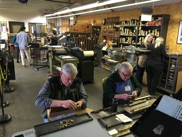
American Typecasting Conference 2018
Photos (l-r, clockwise): The foundry at M&H Type, Lewis Mitchell and Brian Bagdonas looking at M&H specimen books; presentations in the gallery at M&H Type; casting room at Patrick Reagh Printers; casting spec at Patrick Reagh Printers; Brian Ferrett, Bill Welliver and Mark Sarigianis at Prototype Press.
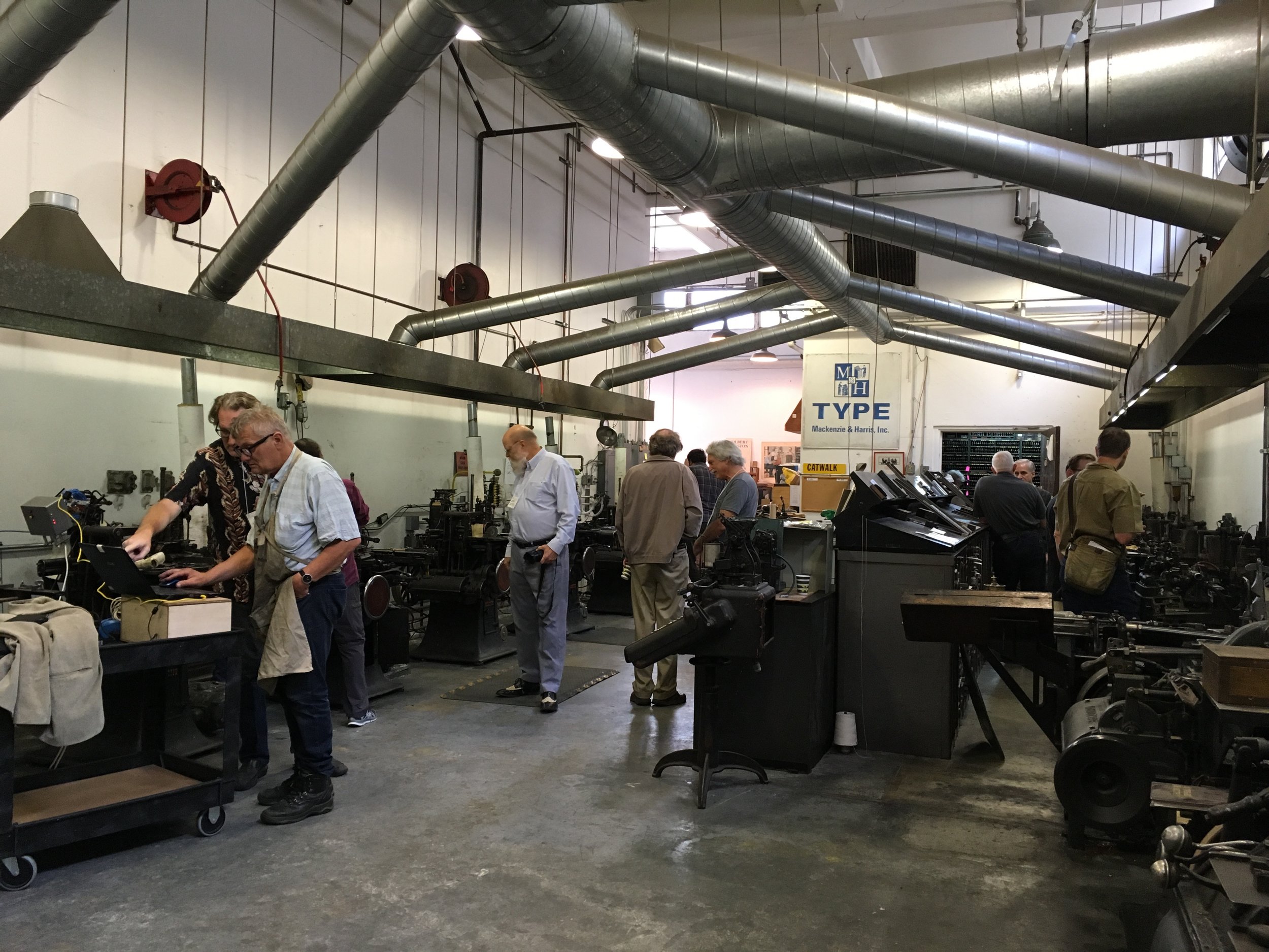
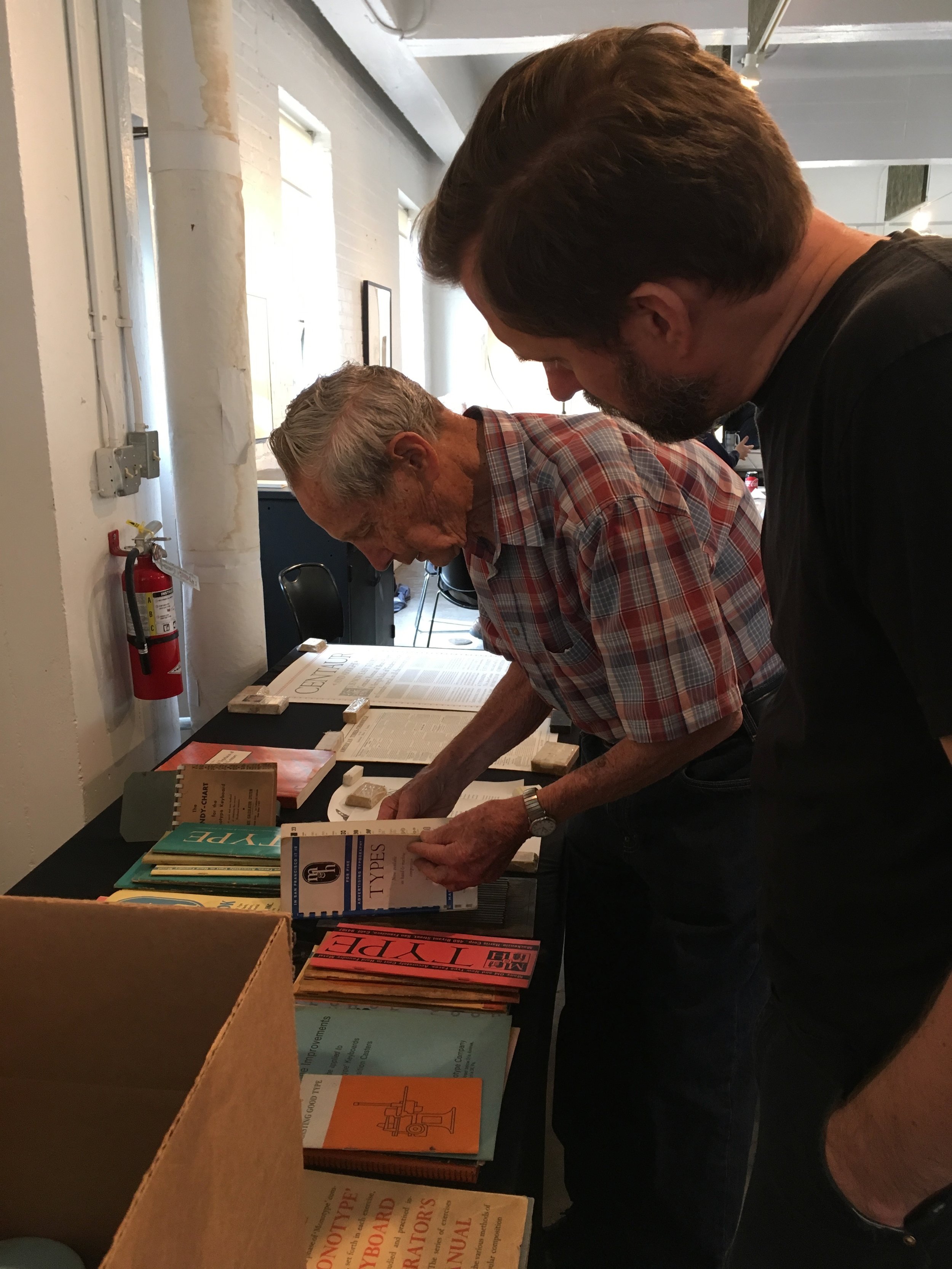
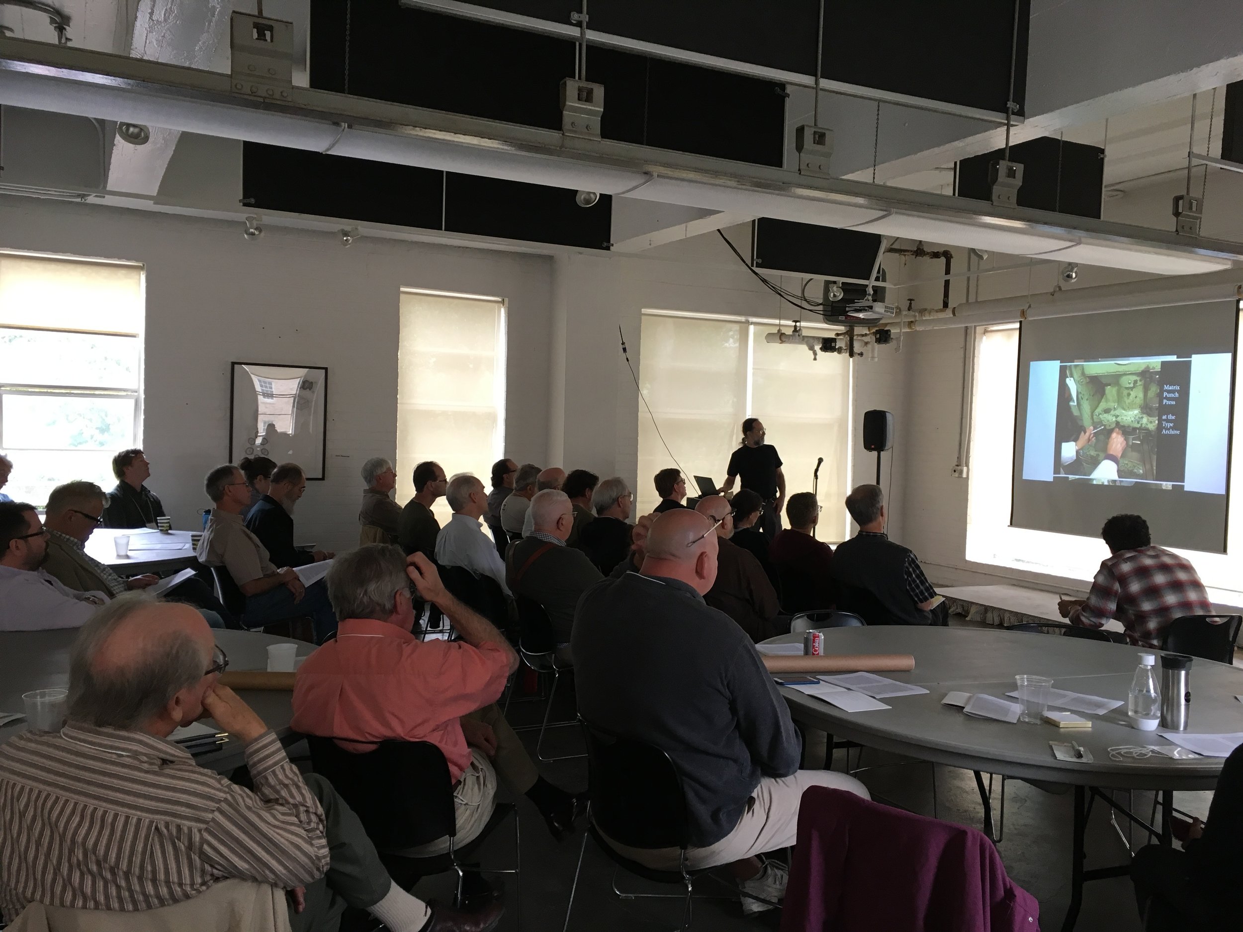
The American Typecasting Fellowship held its 40th anniversary conference at M&H Type in San Francisco from August 23-26th, 2018. M&H is the oldest working typecasting business in the United States, currently employing two journeymen casters and one apprentice. They service the fine press book work of Arion Press as well as casting type to order for customers. We were lucky enough to catch a short visit from Lewis Mitchell, who came by to donate some materials to the conference auction and say hello. He was employed at M&H for more than 60 years but retired about 4 years ago.
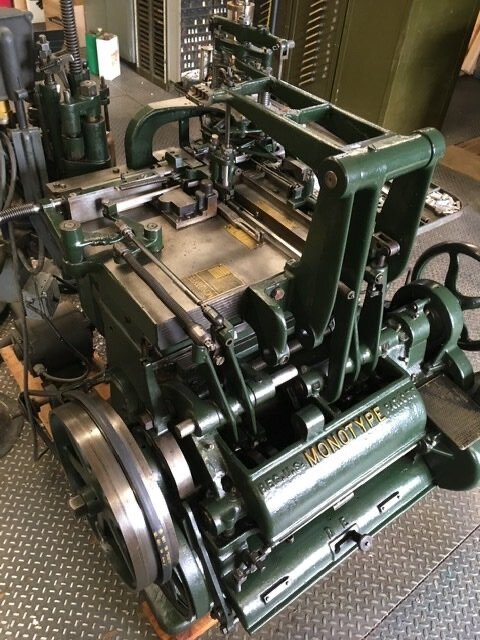
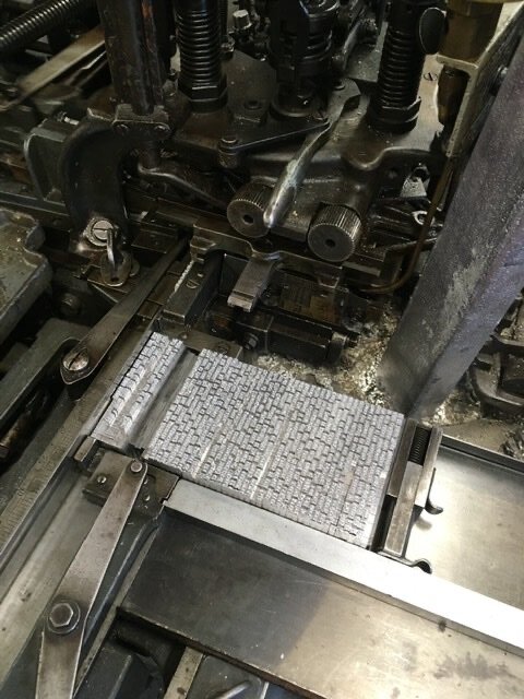
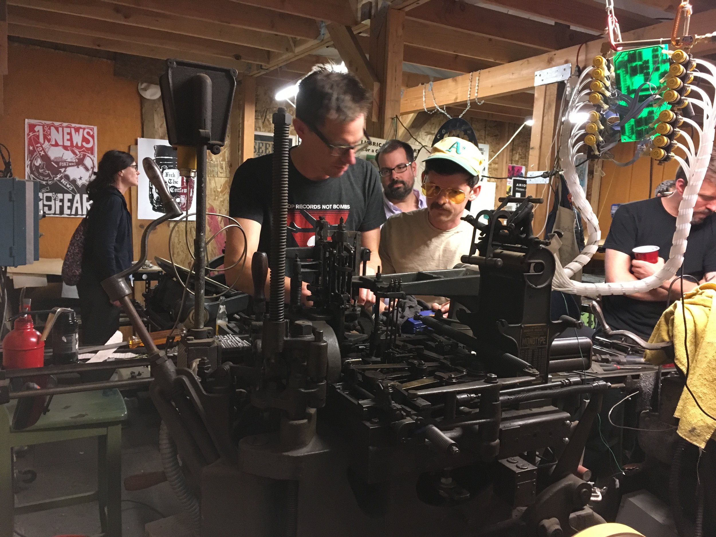
As always, the ATF Conference included technical sessions, with hands-on work opportunities. I signed up to get an overview of the Monotype Composition casters which they have running with the Welliver interface, since we have just acquired an interface for the C.C. Stern Type Foundry. The programming seems to make sense so long as one can operate the caster! That will be a good winter project.
Tech sessions were followed by a field trip to the Letterform Archive and then a reception at The Box. Both institutions are worth spending some time at, and both have collected more items than one can browse easily. It’s best to rely on the expertise of their archivists and curators, and asking for items relating to one’s own area of interest. A brief stop at the Book Club of California was also inspirational — the special collections library is now well catalogued and searchable online, so with more time one could embark on some great research within the stacks.
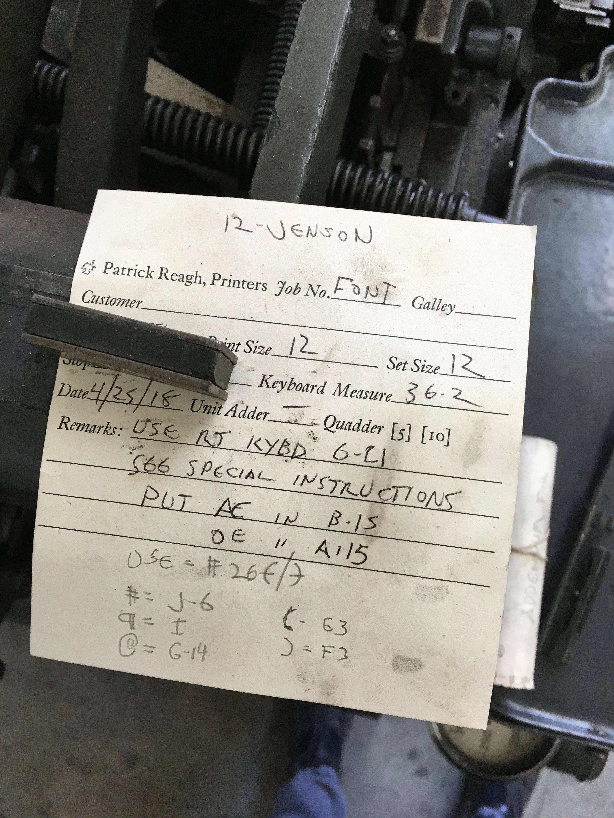
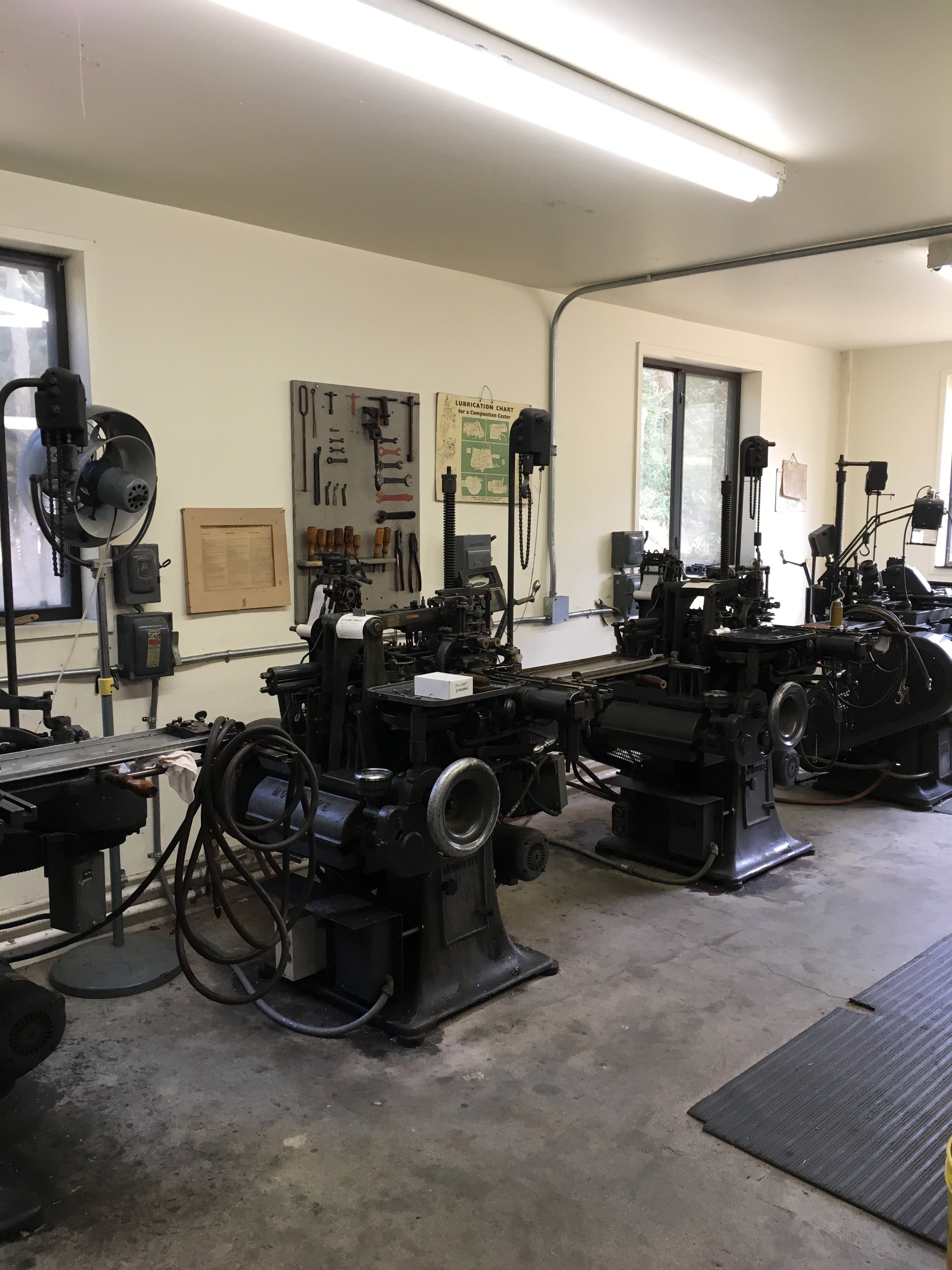
A full day of presentations at M&H included a great mix of reports on hands-on projects, machine restoration, research visits around the world, apprentice reports, and a particularly challenging thesis on the Pantograph presented by Dr. Documento. A small group then gathered at Prototype Press in West Oakland to turn over the casters and generally enjoy being in Mark’s book printing studio. On Sunday, Pat Reagh hosted the whole group up in Sebastapol at his print shop. We’ve visited Pat before, but it still awes me to see the body of typographically rich work he has produced over the years.
So, after a full four days, we returned home with our bundle of keepsakes and plenty to consider.

Stumptown Printers could use a hand ....
For nearly 20 years as a co-owner and worker at Stumptown Printers I’ve been collecting ink underneath my fingernails in pursuit of a commercial printing career. As things change with technology and the industry as a whole, our business is feeling the pressure and having to adjust rapidly. We’ve been actively working to create more opportunities to further the craft of printing through Stumptown Printers and related volunteer activities at the C.C. Stern Type Foundry, but we need a boost from the community to make this venture a continued success. Please take a moment to read our post and consider a gesture of support.

Summer Intensive Letterpress Course
PNCA is offering a set of summer intensive courses from June 18-23rd that I’m pleased to take part in. Registrants can choose from seven different tracks, including a letterpress class that I will teach. I will be working on a small edition broadside print, using it as a teaching tool for demonstrations and discussion. In turn, students will design and print their own editioned poster, broadside, or simple folded book structure. The focus will be on hand set type and creative image making. Participants will receive instruction on how to trouble-shoot challenges involved in printing: we will discuss how to achieve fine printing through exact make-ready and packing techniques, careful typesetting and registration, ink mixing for color matching, foolproof lockups, and proper impression on the Vandercook Proofing Press.
As part of the class, students will be able to opt in to two special add ons:
A private weekday visit to Stumptown Printers to see the workings of a small “job shop”, and a guided tour of the C.C. Stern Type Foundry on June 16th to witness the process of metal type casting.
Register here: http://ce.pnca.edu/adult
Marfa Myths 2018
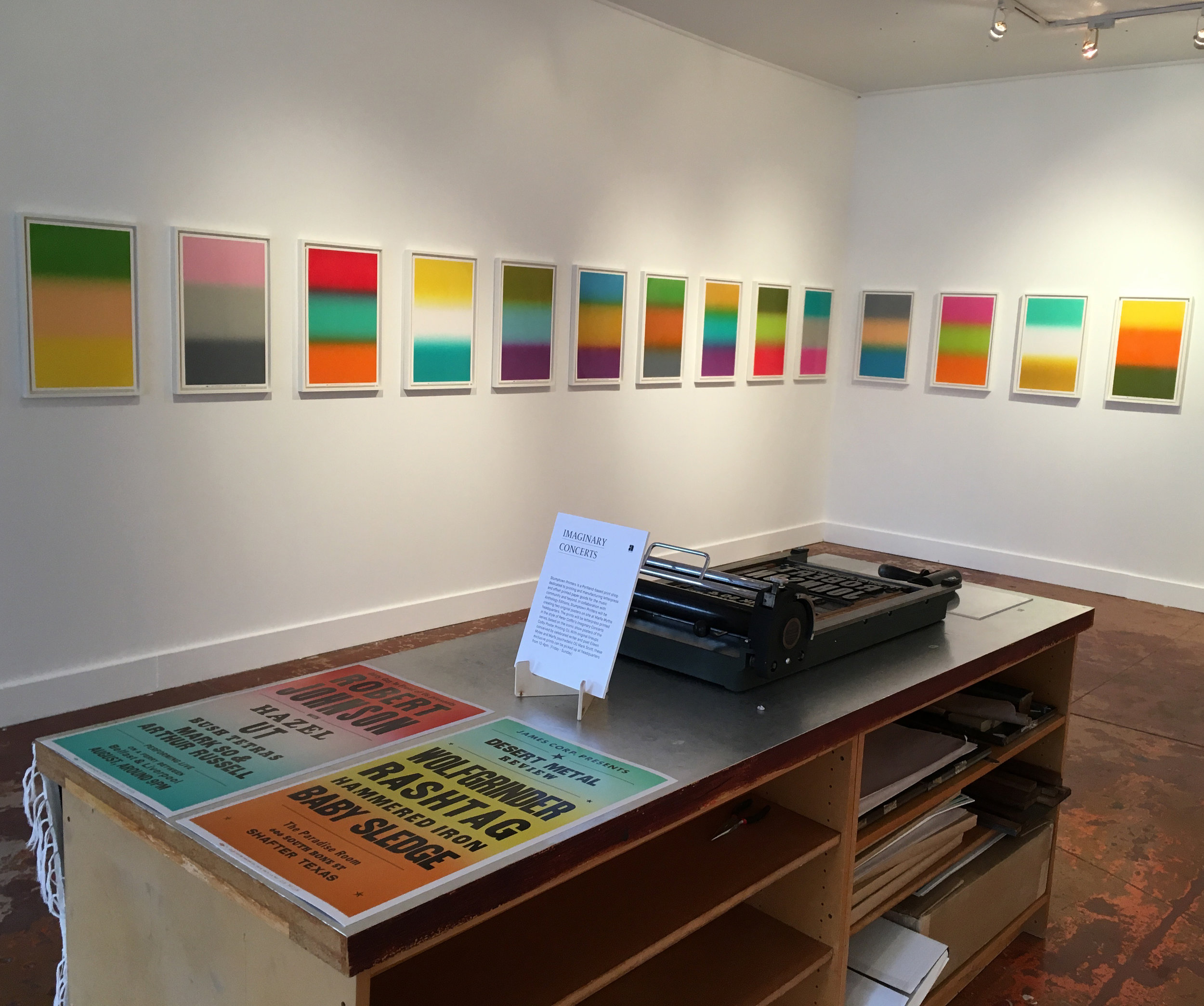
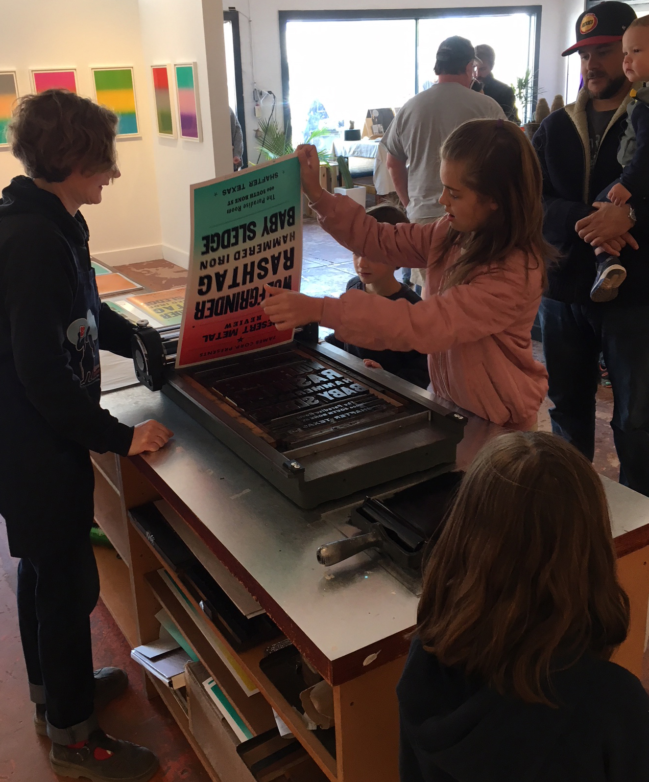
Thanks to Anthology Editions for including Stumptown Printers as part of Peter Coffin’s Imaginary Concerts exhibit at Marfa Myths 2018! Peter had worked with Colby Poster Company previously to commission a number of custom split fountain prints which were on display. We replicated three of the color combinations in a very limited quantity as part of this project, then set and shipped two complete type forms to Marfa for the event. Each composition was an invented lineup, one curated by Eileen Myles and another by Mark Scott, and we locked them up on site using a sign press borrowed from Red Press Printing. Brian and I had great fun helping locals and festival goers pull commemorative prints over the course of three days. We marveled at how quickly the ink cured in the dry desert atmosphere!
Photos are from Marfa Studio of Art gallery space.
You can also check out the Marfa Myths unofficial keepsake we made to bring with us on the print work page.
The Slow Read →
Over the past year I have been assisting as a project manager to local artist and educator, Barb Tetenbaum, with an incredible public art project called The Slow Read. It is a summer-long viewing of page spreads of Willa Cather’s novel, My Antonia, in celebration of its Centenary. Barb has been working with this novel for nearly a decade, creating art installations and printing artists books inspired by the literary work. This transformation of the novel into a nationwide daily visual simulcast is designed to be experienced with others in community spaces like libraries, town centers, schools, and art centers. It’s an opportunity to appreciate the value and beauty of the novel, and to discuss some of the timeless issues addressed in the work — immigration, women’s rights, and land conservation. I hope you will take a moment to watch the Kickstarter and consider a contribution to the campaign.
Printing Business Course at PNCA
Feb 28, 2018 - Mar 14, 2018
6:30PM - 8:30PM
This offering is a conversation for printers about decisions to make and things to consider before launching a company or taking on commission jobs. Covers professional practices in the trade, experience & education, business plans & financial resources, legal and moral responsibilities, client management, vendor sourcing, operations, pricing and equipment.
Register on the PNCA Continuing Education site


Guild Card No. 5
Letterpress, hand-set metal type
2.5" x 3.5"
The C.C. Stern Type Foundry issues new cards annually to supporters of the museum. Each guild card is printed in a small edition.
Type is hand-set 12pt. and 18pt. Centaur, designed by Bruce Rogers. The Monotype caster and keyboard ornaments were purchased from Stichting Lettergieten 1983, in Westzaan, The Netherlands. The backside pattern was built from Monotype ornaments cast at the C.C. Stern Type Foundry, the number five is Franklin Gothic Condensed.

Pressing On at Clinton Street Theater
The C.C. Stern Type Foundry is presenting a screening of Pressing On: The Letterpress Film this coming Tuesday, the 19th at The Clinton Street Theater. You can see the post about the event and get details here. It’s a beautifully shot film that interviews multiple generations of the letterpress community in the Midwest. Some of my favorite printers and type casters are featured, including a few that we visited in their home shops just a couple weeks ago!
I printed the poster at Stumptown Printers — a form constructed entirely of hot metal composition. A real treat! Ludlow, Linotype and a Monotype Sorts Caster were all used to cast the type and ornamentation, which we printed in two colors on Fabriano Rosapina. The particulars are in that red arrow, if you truly want to geek out about which type face is which. A limited amount of posters will be for sale at the event, helping to support the costs of the film screening.
Looking forward to gathering at the theater!