The Northwest Archivist’s Annual Meeting is just a month away! This year activities will be held in Salem, Oregon at the Convention Center, which is centrally located downtown. The theme is “Looking Back, Moving Forward,” I am excited to attend and to hear more about how the field of archives continues to adjust and embrace change. It will be the first time the group has met in person in three years. Archive curious? I hope you will join me there.

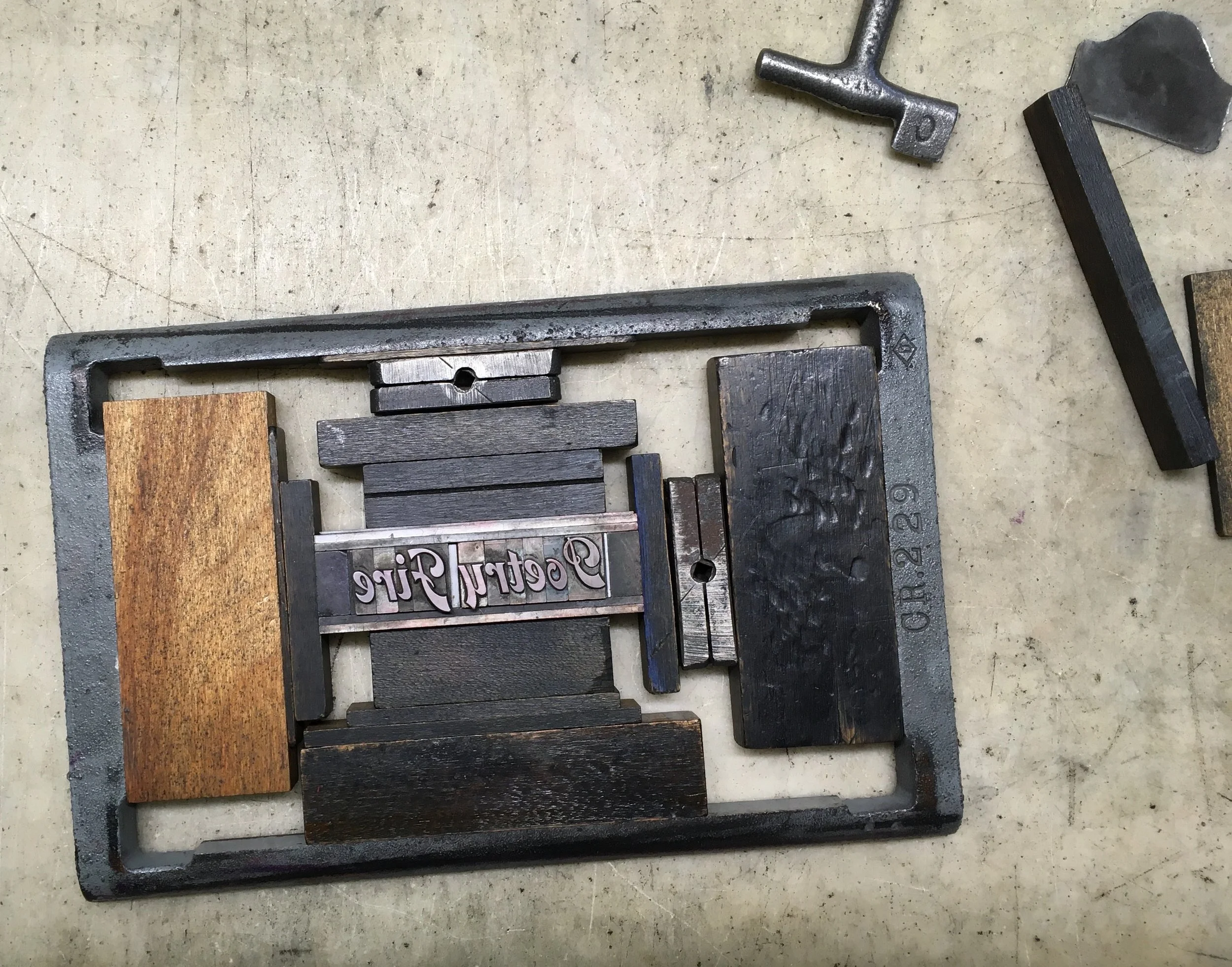
Poetry Fire Coasters
Letterpress, hand-set metal type and ornament
4” x 4”
This cocktail is one that we concocted during the height of the Coronovirus Pandemic, designed to be enjoyed while reading poetry aloud around an early summer backyard fire. The coasters with this recipe were created for the Spring 2023 NW Letterpress Network group exchange in a small edition on the tabletop Craftsman press.
Hand set in 30pt. Univers Condensed, with 48 pt. ornaments. The “Poetry Fire” type is from a collection we procured in the late 1990’s and is still unidentified, so if you know what it is please enlighten me.


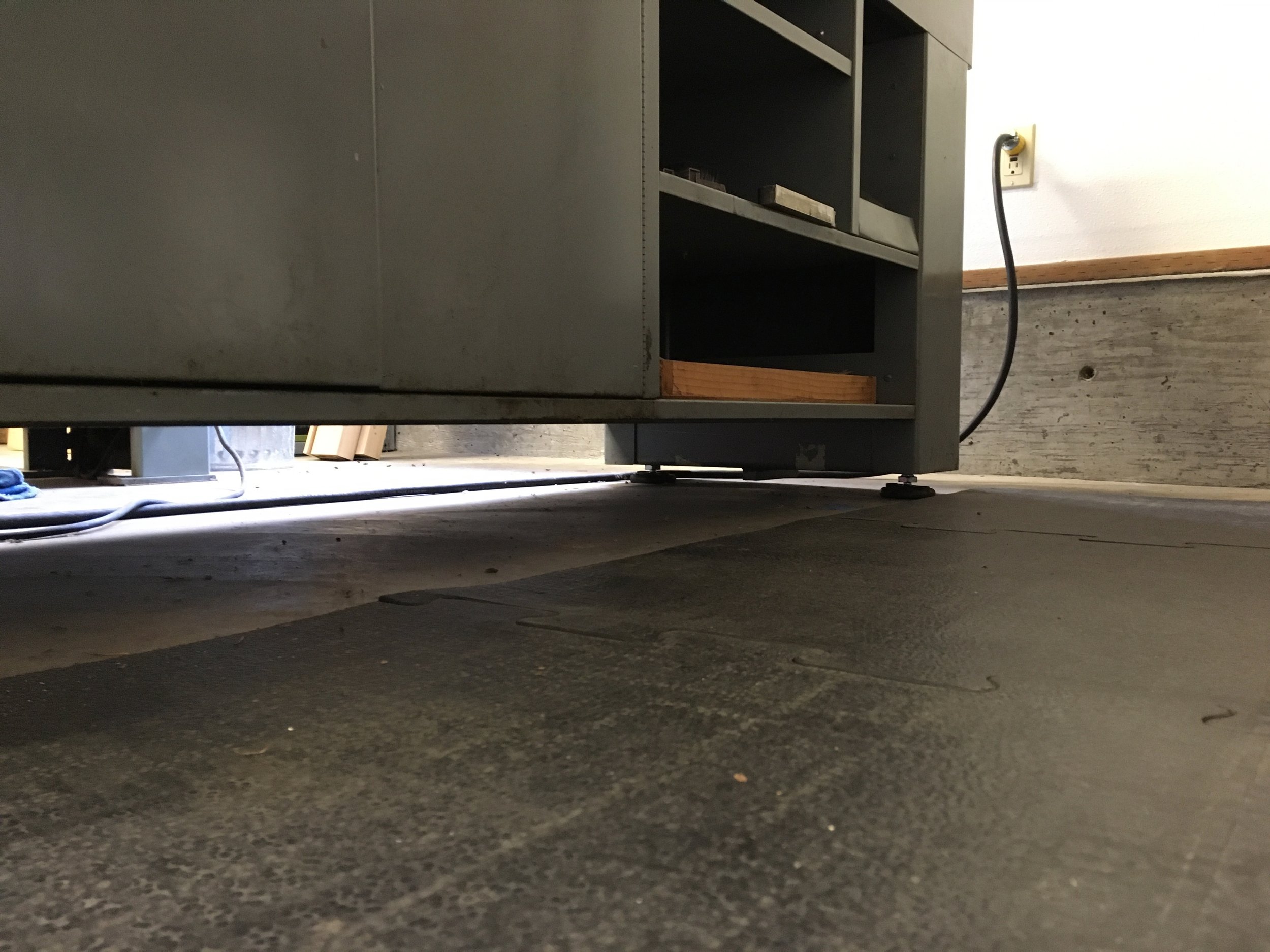
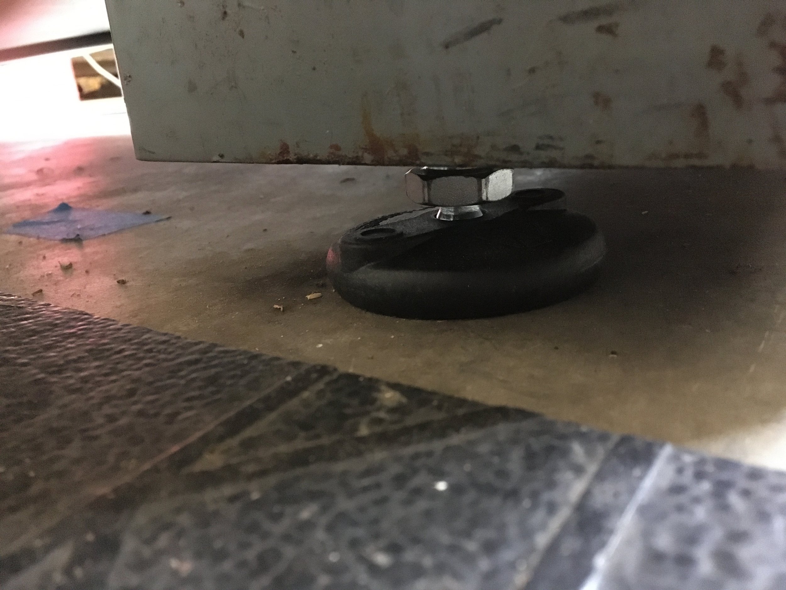
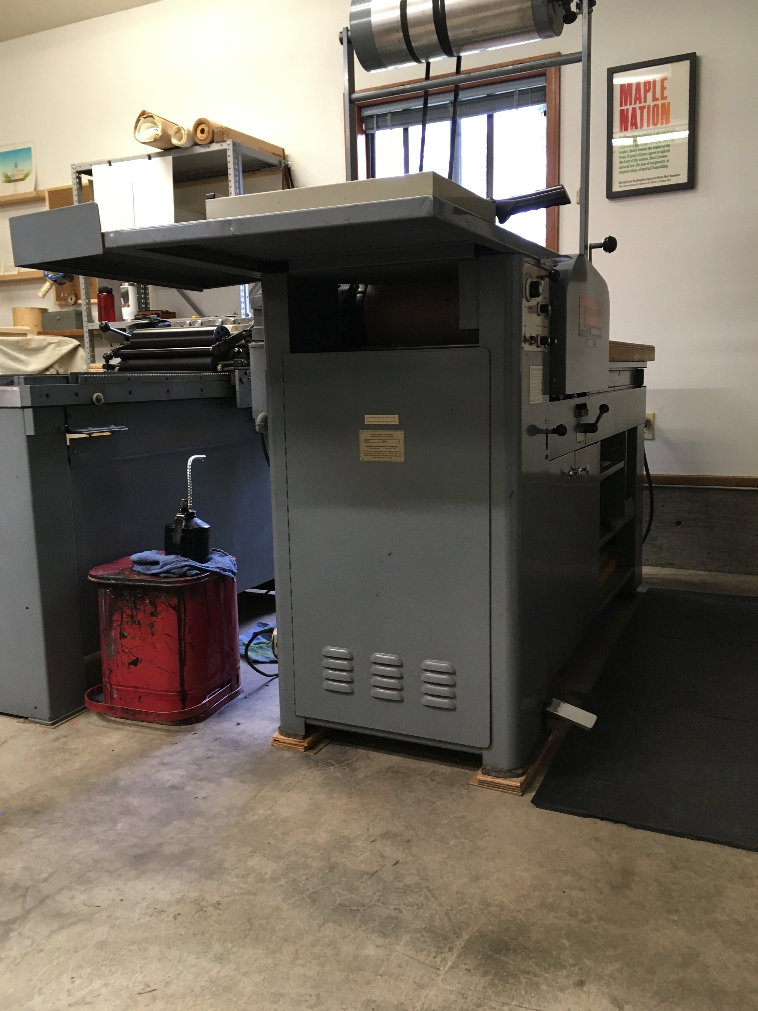
New Feet!
This year marked a real turning point in my relationship with the Universal 1 that we’ve stewarded for nearly two decades — we finally took it off the 4x4 skids and added feet! For years the press has been “a little” too high for me to operate comfortably, yet it was mounted into the skids in such a way that it seemed like the dismounting might cause more problems than it solved. With this move to a new shop space in Clatskanie, we decided it was time to invest in some heavy duty adjustable machine feet and lower it to a more sane (and level) height.
Since NA Graphics wasn’t able to access anything in the Vandercook blueprints as far as replacement or manufacture of the original feet, here are the specs:
Bolt-Down Swivel Leveling Mount
4" Long 3/4"-10 Threaded Stud
3" Diameter Base
I’m super pleased, and it’s printing beautifully since the adjustment.


The Winter Rain
Letterpress, hand-set metal type
6” x 4”
Poem by Wendell Berry. Created for a NW Letterpress Network group exchange in the winter of 2022, in the midst of the Pacific Northwest rainy season.
Hand set in 6 and 10 point Centaur, printed with PMS 8184 metallic over a custom transparent silver metallic ink. Paper is from a stash of long-discontinued Neenah Blue Moon 120#C.
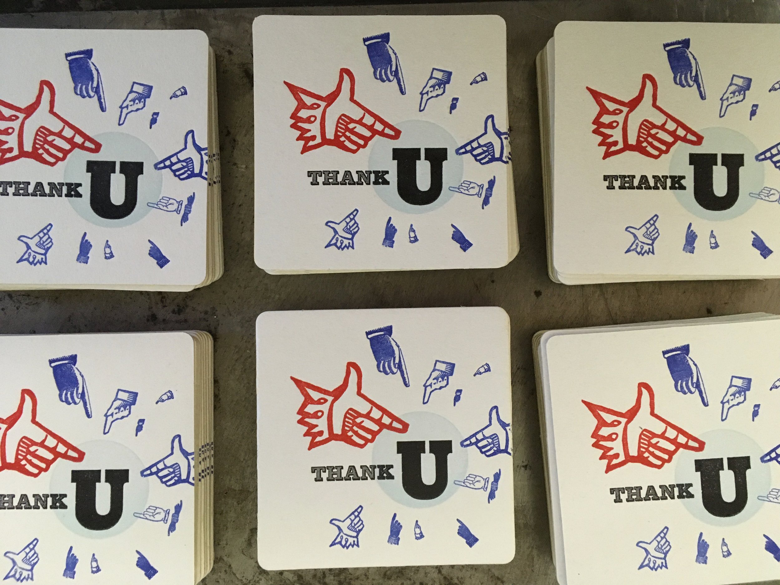
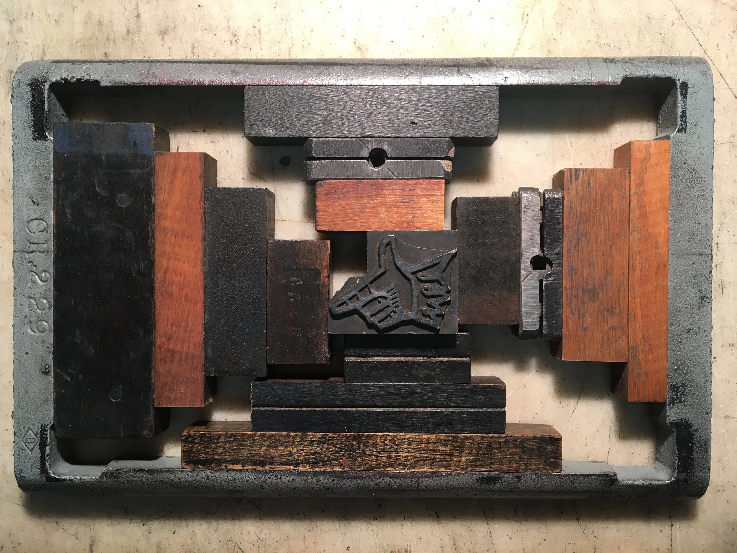
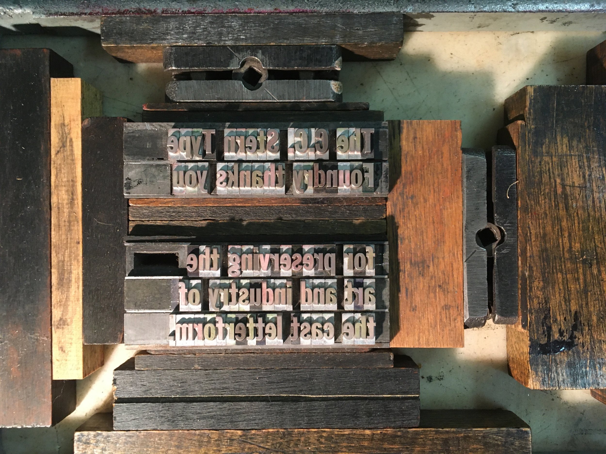
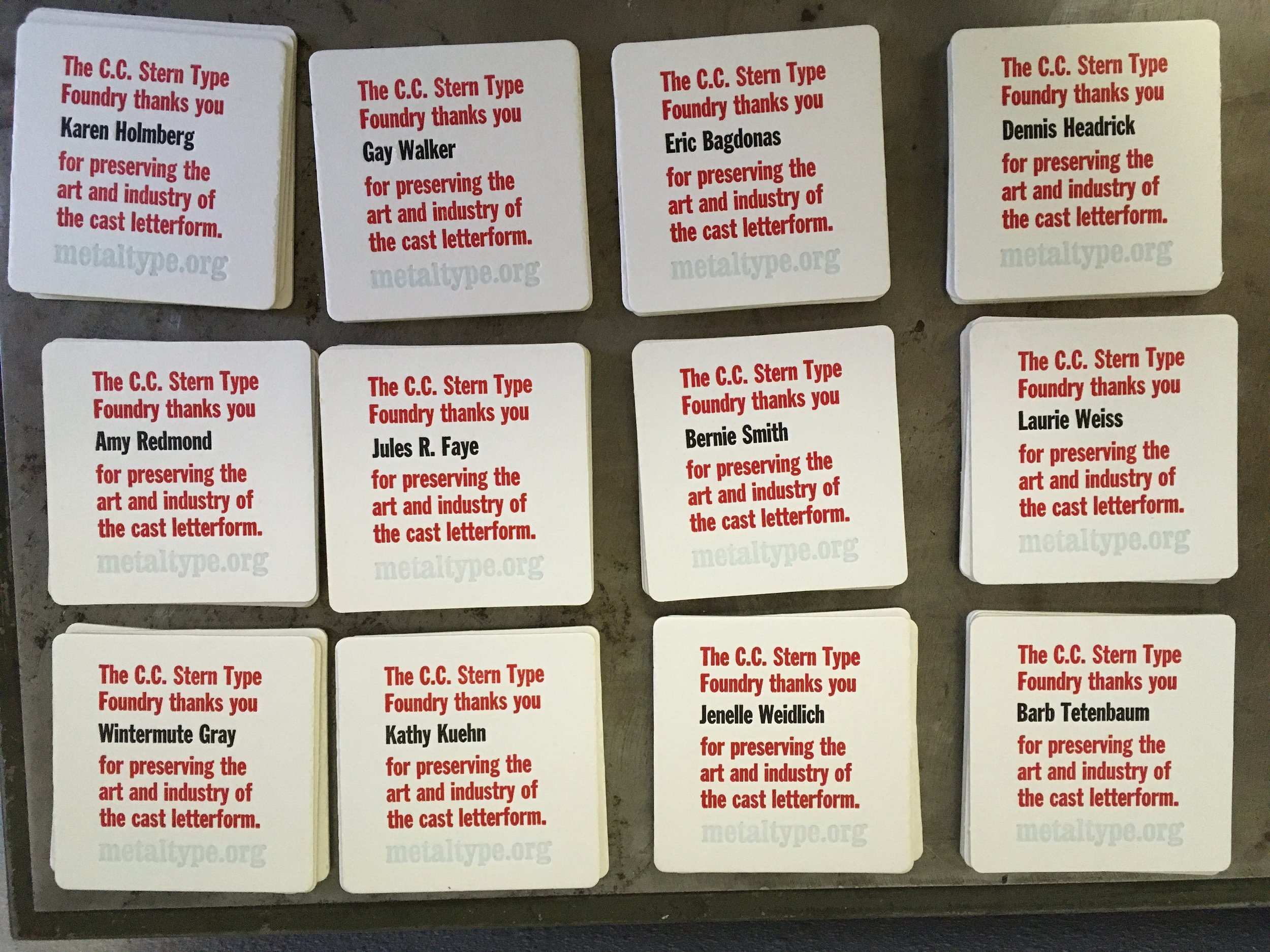
Thank You Coasters
Letterpress, hand-set metal type
4" x 4"
These coasters were printed as thank you gifts for C.C. Stern Type Foundry volunteers that assisted with packing and moving the foundry from Portland, OR to Clatskanie, OR in 2022.
Type is hand-set Stymie Black Condensed, Shaded, Franklin Gothic Condensed, and Egyptian Condensed with metal manicules of varying styles.


Parenthesis 43 Journal Article
The Autumn 2022 issue of Parenthesis, the journal of the Fine Press Book Association, includes an article on the C.C. Stern Type Foundry that I co-authored with Brian Bagdonas. Editor Nina Schneider curated a selection of articles that broadly fit the topic of Movement, and FPBA Chair Inge Bruggeman graciously suggested our inclusion. This issue has interviews with Amos Paul Kennedy, T-Kay Sangwand, Susan Joy Share, and a bit of history about Claire Van Vliet and Janus Press. Our article, entitled “Expanding Back to Our Roots,” pays tribute to the generosity of Jules Faye and Chris Stern, the community they fostered and which has supported both the formation and latest expansion of the C.C. Stern Type Foundry.
Copies of Parenthesis 43 are available from the fpba.com website.

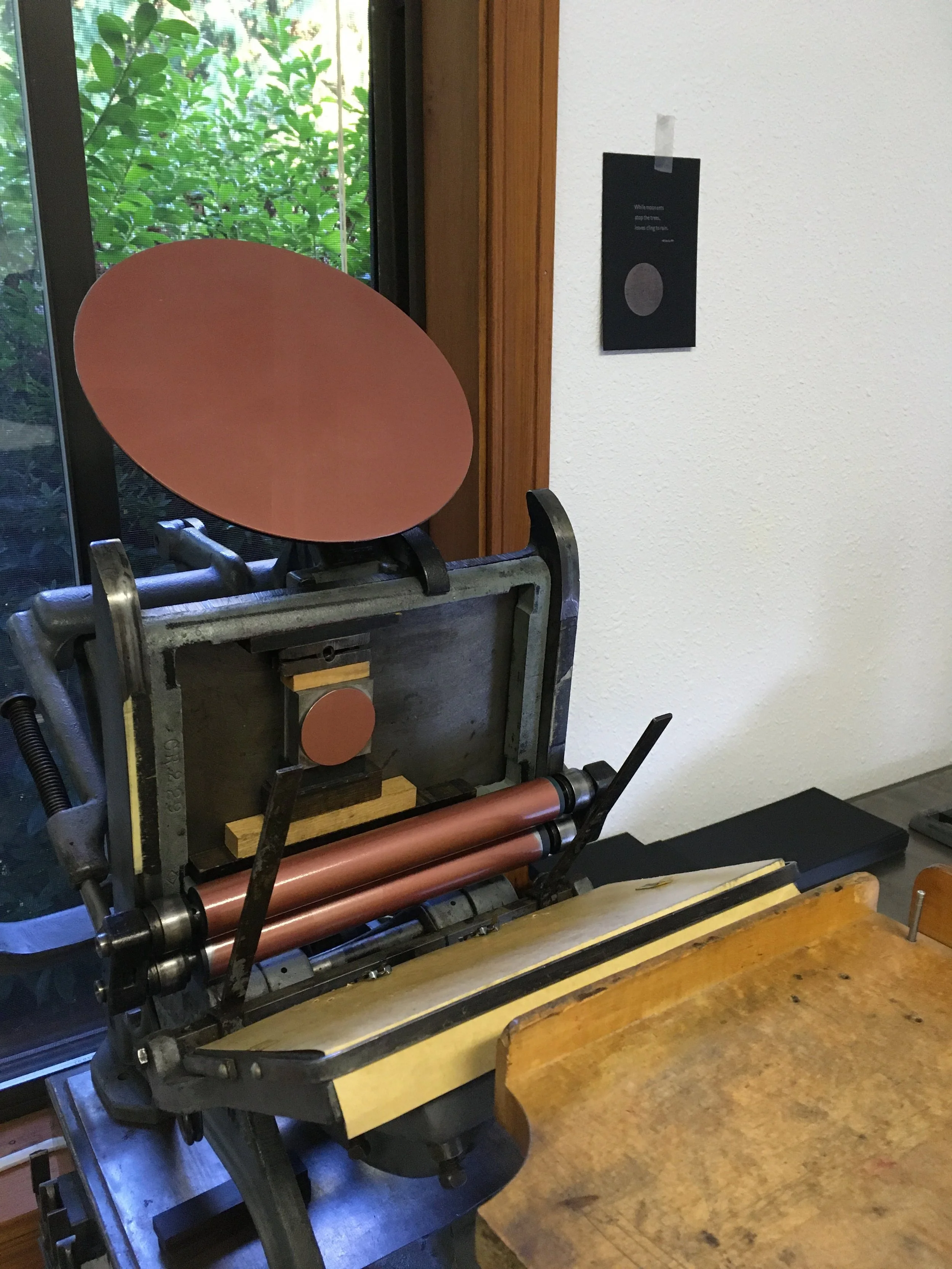
Moonset
Letterpress, hand-set metal type and ornament
6” x 4”
Created for a NW Letterpress Network group exchange in the autumn of 2022, the first official print made in our new shop in Clatskanie, Oregon. After years in storage, the type cases were all available to me and in a long rainy day I was able to set and print a small edition on the tabletop Craftsman press.
Hand set in 6 and 14 point Gill Light, printed in PMS 877 silver metallic ink. Moon is printed from a metal ornament with a pink metallic tint ink. Paper is 24pt. Neenah Packaging Board.


Eudaimonia
Letterpress, hand-set metal type
6” x 4”
Created for a NW Letterpress Network group exchange in the autumn of 2021, as an expression of delight in learning about Eudemonology from a podcast. Eudaimonia has been defined as a life well-lived, or human flourishing. As the balance of the days moved towards darkness, I was searching for ways to flourish in the spirit of mutual aid. Color choice was influenced by the wondrous light of the aurora borealis.
Hand set in Ultra Bodoni, two color background relief printed as a split fountain using a litho blanket for the image block.

Archiving for Visual Artists Workshop
I’m offering a workshop for visual artists related to career documentation, archiving and legacy considerations this coming autumn. It’s a 6 session class, held every other week on Wednesday evenings at the X Gallery Art Storage space. Each session will offer guidelines, best practices, and discussion about specific areas of artwork inventory and storage, studio workflow and management, archive formation, legacy goals and planning specific to artists.
Learn more and register on the X Gallery Art website

Presentation at Northwest Archivists Conference
On Wednesday, May 4 at 11am, I’ll be involved in a presentation about working with artists’ archives, touching on the importance of career documentation, collection preservation and storage, management, legacy planning for living artists, and stewardship specific to artwork collections. This presentation is part of the 2022 Northwest Archivists Conference “Not to be Forgotten: the resiliency and sustainability of archives to preserve untold stories” which will be held virtually from May 2-5. Register and find out more on the conference website.

Women in Type
Women in Type was a three year research project at the University of Reading led by Fiona Ross, Alice Savoie, and Helena Lekka, and highlights the contributions of women to the type manufacturing process. The British Monotype and Linotype companies each employed women as part of departments where they worked to develop and produce typefaces that were often attributed completely to male designers. The Women in Type website is the result of an effort to make this research more accessible to the general public. It includes an overview of roles and responsibilities, brief histories of women who were employed by both corporations (based on first person interviews), and an excellent reading list.

Separation
Letterpress, hand-set metal type
6” x 4”
A short poem by W.S. Merwin that felt appropriate to mark the past year, with all it’s various absences. Sent to friends and family.
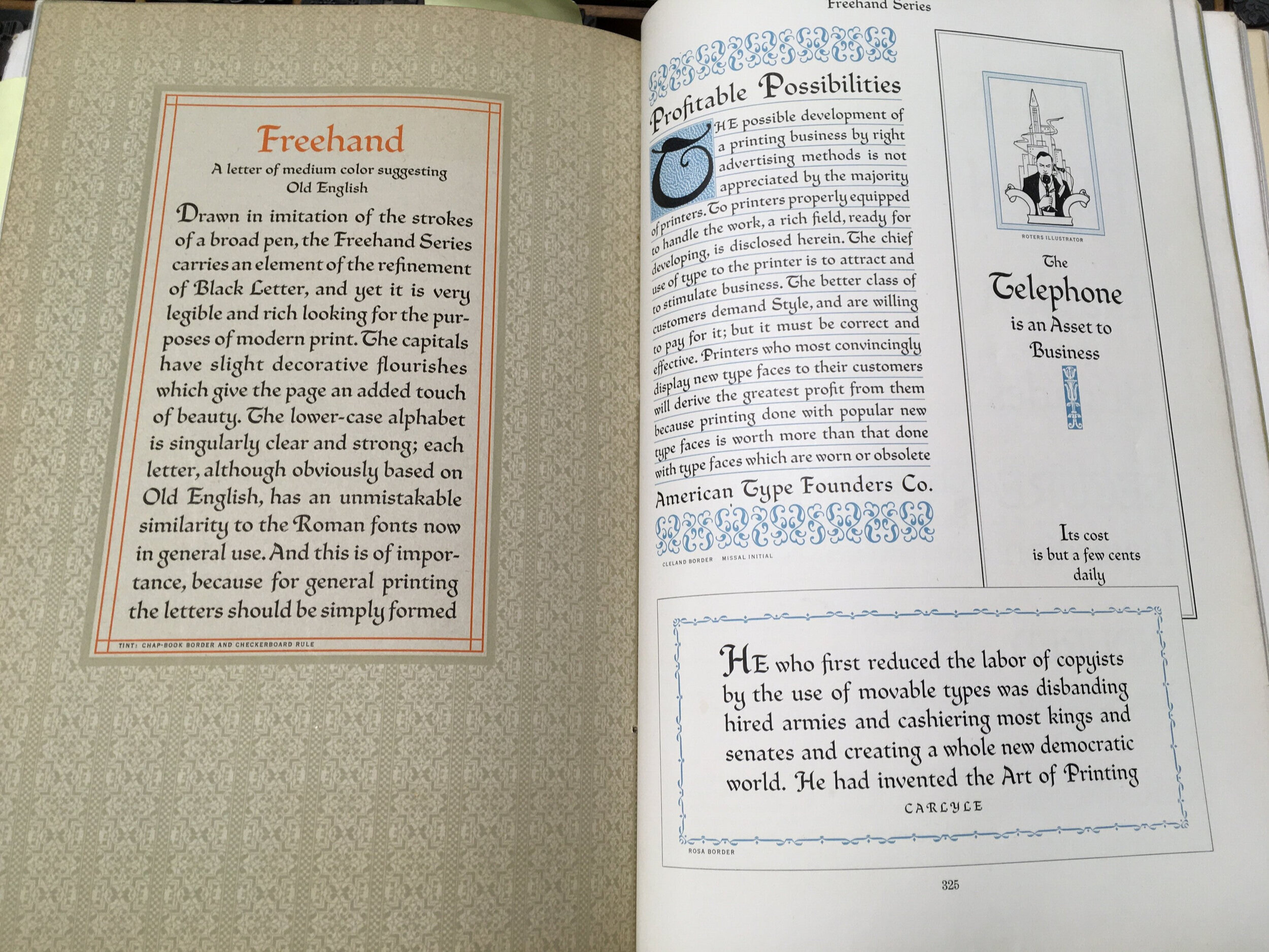
Text is hand set in Freehand, a metal typeface designed by Morris Benton in 1917 and released by American Type Founders. Printed in one color on Via Warm White 100#C. Sewn with inherited embroidery thread, various colors.
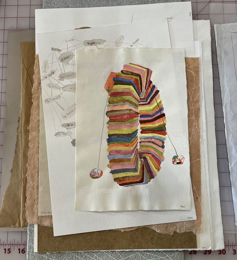
Marie Watt Studio Archive
Images copyright Marie Watt Studio (Instagram)
In mid-2021, I began work with artist Marie Watt and Studio Manager Madalyn Barelle to better organize their studio archives. I started by assessing their existing print and drawing inventory, sorting and labeling in addition to updating the records and inventory numbers in their studio collection management database. We were able to rearrange materials to increase accessibility and improve the work flow in that area of the studio, separating the archives into “deep storage” or legacy items, occasional use, and more frequently accessed works on paper. When applicable, archival enclosures were replaced to be more durable and most efficient with storage space (at a premium in a prolific artist’s studio). Much of this work was funded by a grant from the Regional Arts and Culture Council in preparation for Marie’s mid-career print retrospective at UC San Diego, “Storywork: The Prints of Marie Watt,” scheduled to open February 4, 2022.
As we look to the year ahead, I will continue to assist with annual archiving needs, inventory and database updates, digital record cataloguing, and ongoing discussions related to long-term legacy planning. It’s an exciting time in the studio as the team has grown to include another Studio Manager and a dynamic group of artist assistants. The pace and the amount of new work constantly in creation means a functional archiving and inventory system is important to both idea generation and productive workflow.
You can find out more about Marie Watt’s art, upcoming exhibitions and community engaged events at mariewattstudio.com.

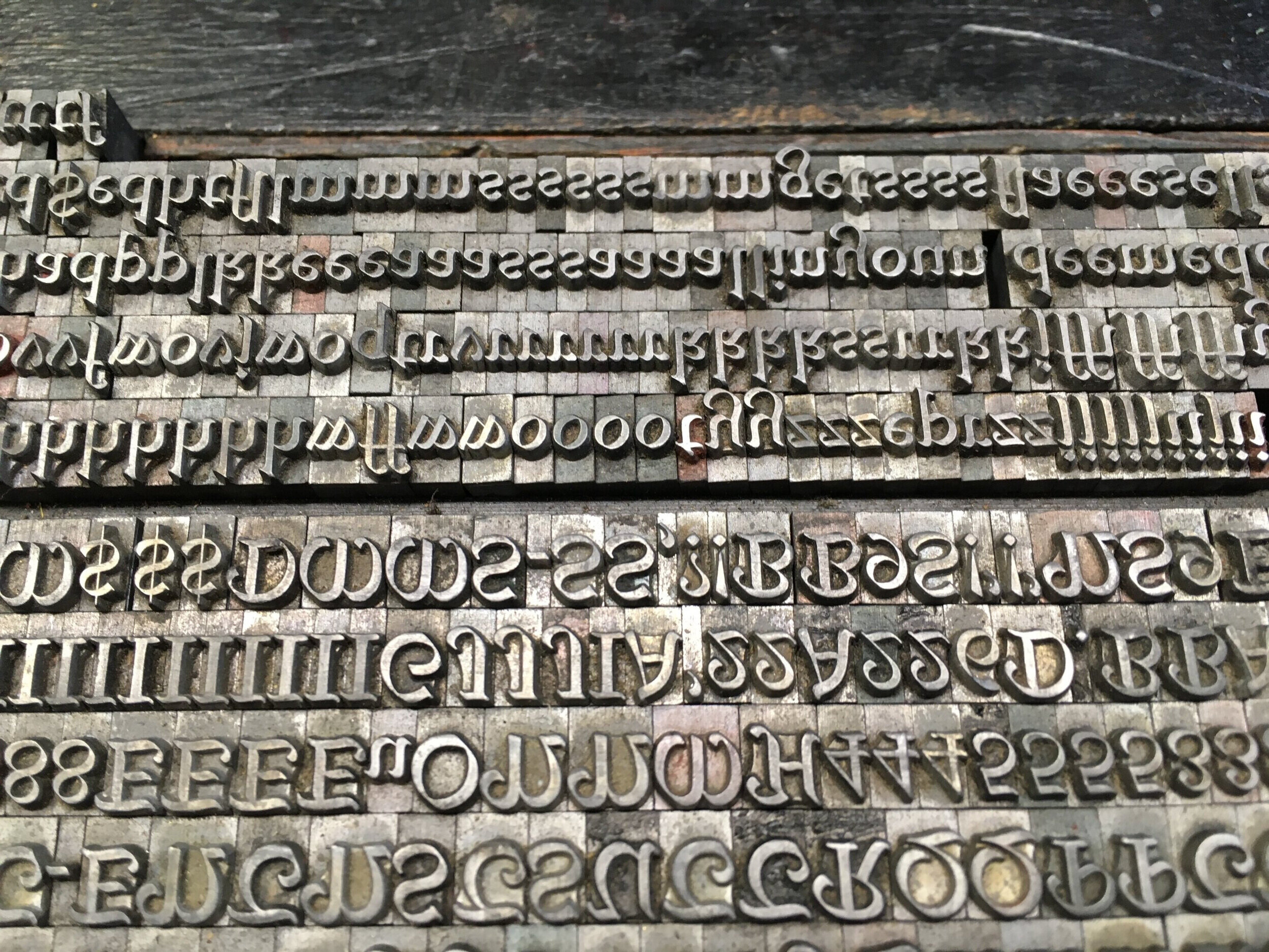
Overdue Type Identification
In early December 2020 I was able to finally take Amy Redmond’s Long Distance Letterpress: Type Forensics workshop about type identification and inventory, which she had adapted for an online class. Amy’s approach to type identification is very much about stewardship. She focused on honoring the legacy of the materials in use, taking the time to learn how and by whom the type was made, and holding only the faces you need in service of keeping more type in use. Add her technical prowess and experience as both a typographer and with the inventory of the Stern & Faye type collection, and a dynamic and useful workshop was born.
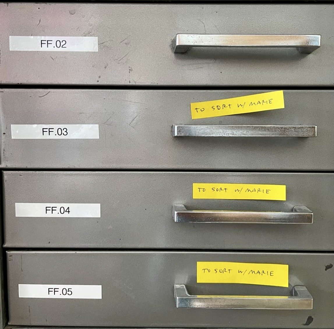
When we moved most of our type and equipment from Stumptown Printers into storage, we chose to save out three galley cabinets which house the bulk of our display type at 24pt. and above. One of my projects is to go back though and better organize and identify the contents. Many of the ornaments have never been proofed, and the typefaces are only partly catalogued. Additionally, many of the galleys have surface rust that needs to be removed. So, I used the momentum from this workshop to take some needed action.
First, clean. I needed to remove surface rust on our galleys before I could do any work of substance. I used Evapo-Rust (on recommendation from Ivan Snyder), soaking then rinsing the galleys. I treated enough that I could fill one column of our cabinet so that I could start to move type and concurrently soak the prior galley after a transition.
Second, organize. I separated the typefaces that have been stored together and labeled their galleys. In many cases we have half a galley of identified type and the other 50% unidentified. This step resulted in a lot of galleys labeled “unident” and “type to distribute”. I did keep small display fonts of multiple sizes together (i.e. 24pt. and 36 pt. of the same face) because we don’t have unlimited space. I also consolidated and retied a lot of the standing forms. With only three galley cabinets to deal with, I was able to alphabetize the identified typefaces (leaving gaps here and there to account for shuffling as new faces gain their identity), isolate the galleys that needed attention, and set up a section for current forms in use.
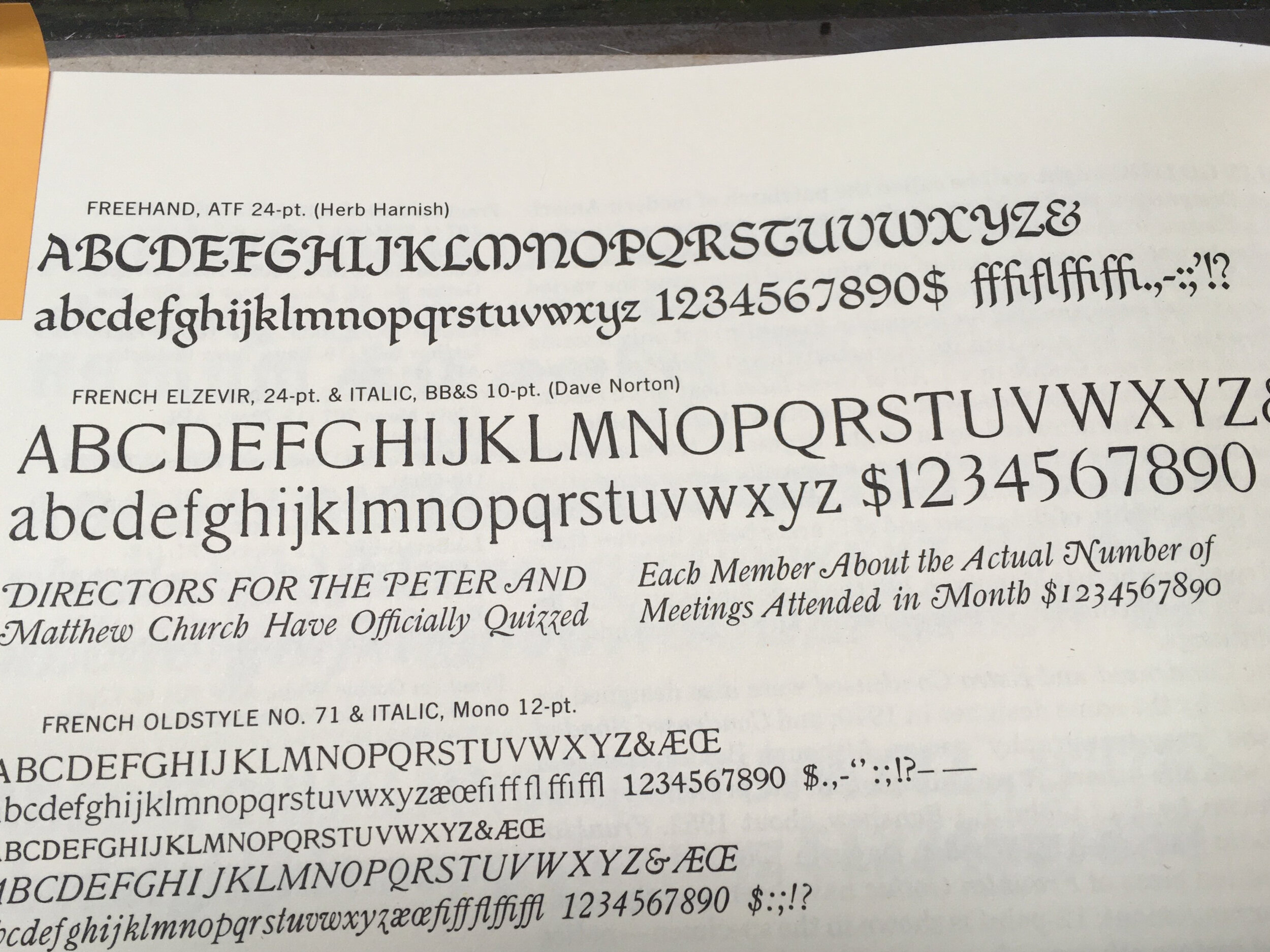
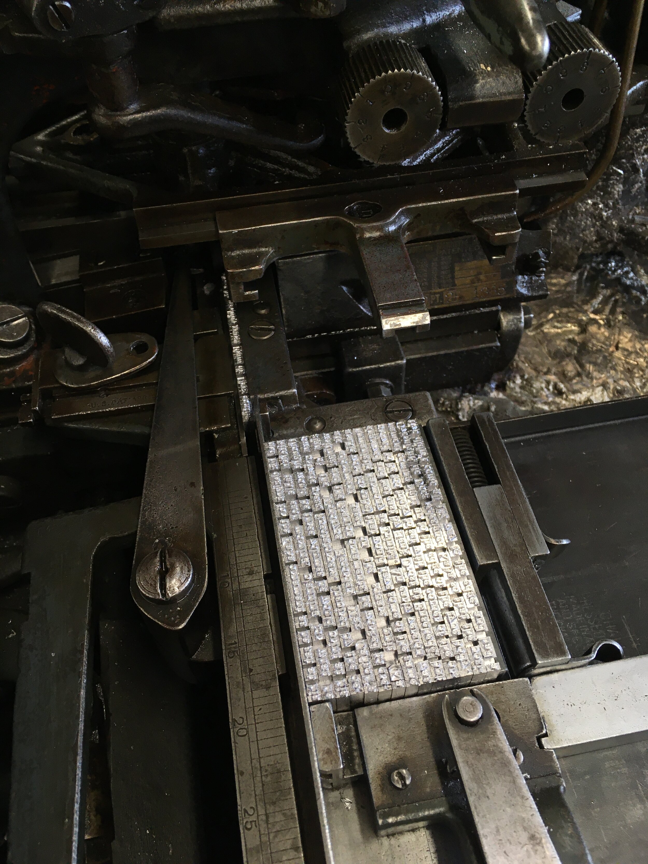
Third, identify. “Unident” galley number one contained a calligraphic face that I am embarrassed to admit sat on the same galley for over 20 years. It was mixed with a couple sizes of Old English and I am afraid we didn’t poke farther back than that in all the years that we pulled type from this particular location. I selected a couple characters and referenced our copy of Mac McGrew’s American Metal Typefaces of the Twentieth Century. It’s a pretty distinct face, so I was quickly able to identify “Freehand”, designed for American Type Founders by Morris Benton in 1917, and then cross-reference it in the ATF Specimen Book. As a child who spent hours practicing calligraphic standards with different width pen nibs, and a fan of the typefaces designed by Eric Gill and Jim Rimmer, I was pleasantly surprised to discover this hidden treasure. And, despite that appreciation, I hardly know what to do with typefaces so closely related to hand lettering. Luckily, I did have a very short poem by W.S. Merwin waiting to be set in type and this face was appropriate to that use.
The next step is to document this particular typeface by pulling a proof and counting characters using the specimen ID sheets that I adapted from ones that Armina Ghazaran (Type & Press) uses at the Museum of Industry in Ghent, Belgium. These are stored in a binder in our shop space and include location and name, in addition to the information about provenance. My goal is then to enter the data from these physical sheets into the spreadsheet template that Amy Redmond (Amada Press) developed in order to have a document that can easily be shared with others.

The Point Vol. 3
What a year it has been! As a volunteer and active Board Member at the C.C. Stern Type Foundry, we have had to put most of our public programming on hold due to COVID-19 risks. The museum facility is just too small to host people safely. Despite that, I have been able to go in after hours or on weekends with one other volunteer, and continue to apply myself to learning the operation of the Monotype Composition Caster. A couple weeks ago, we finally got all the type cast, proofed and printed in the form of The Point (issue #2)! It feels like an extra special achievement under the circumstances.
This week we also sent out the final 2020 newsletter via e-mail, summarizing this year’s activities and what is in store for the year ahead. It looks like we’ll be contending with many more months of the pandemic, so it’s going to be a hybrid of in-person skill building and on-line community building. The full newsletter is linked here, and a direct link to our end of year fundraising is here. Your support allows us to carry on the mission of the C.C. Stern Type Foundry.
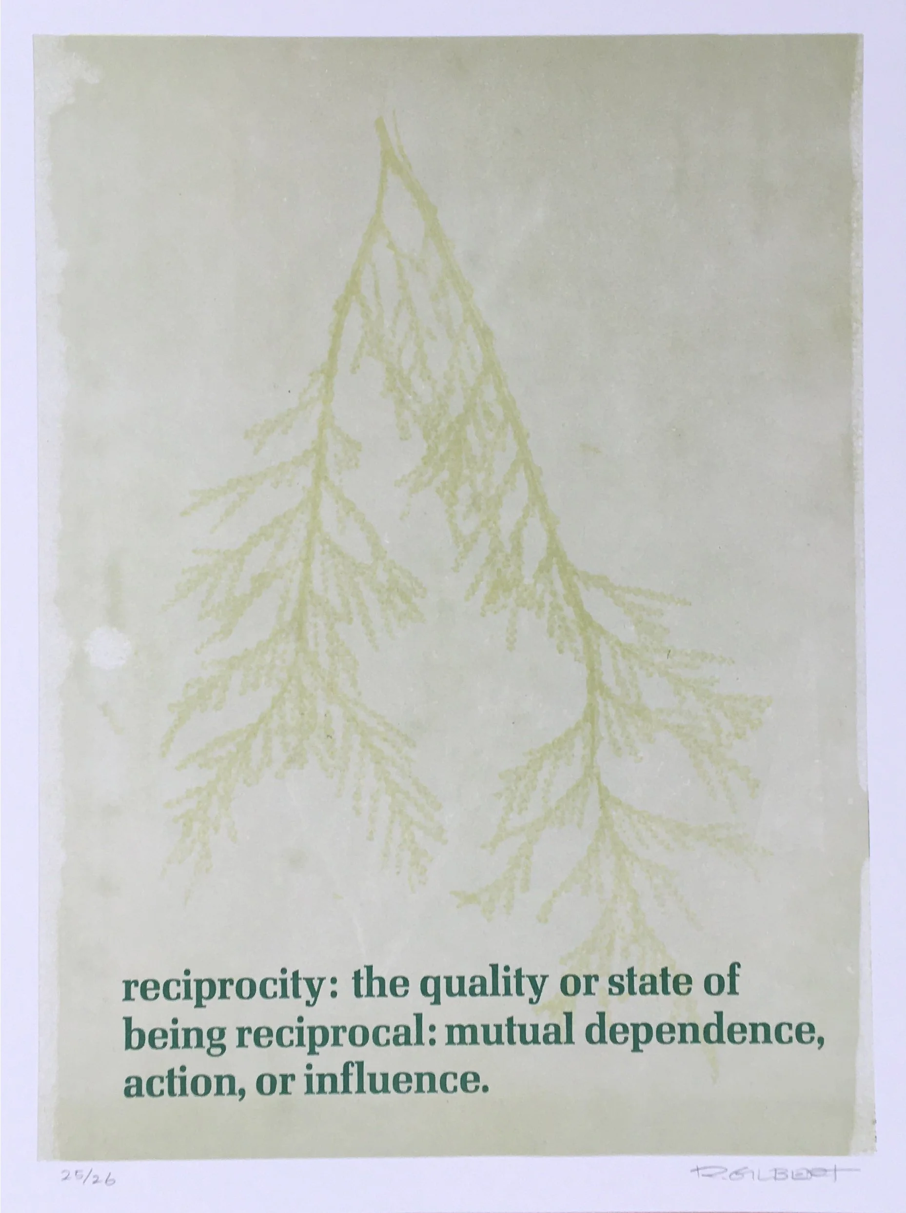
Reciprocity


Letterpress, hand-set metal type
9” x 12”
Editioned for the College Book Arts Association regional exchange in winter 2020-2021. The theme was environment/landscape/land acknowledgement, taking focus on the region we currently inhabit. I was influenced by the powerful concept of reciprocity as it relates to all life, with the Western redcedar (or “Tree of Life”) at the center.
Text is hand set in 30pt. Melior, designed by Hermann Zapf and cast by Stempel Foundry (Germany). Image is relief printed in three colors, including branches from a redcedar collected on a winter walk in the neighborhood. Printed on Classic Crest Eggshell 100#C.

X Gallery Art Storage
In the summer of 2019 I began helping out at X Gallery Art Storage as they expanded their business and took in some larger artwork collections, and I’m pleased to continue working with the team there in a part-time capacity for the foreseeable future.
X Gallery is a small company, serving Pacific NW collectors, institutions, estates, and artists. While the basic service is secure, climate controlled storage of artwork, over the past year X Gallery has increased capacity for inventory, research, placement and valuation services. We are in the process of implementing a new and robust Collection Management System, creating additional storage in the vault, and have just launched an updated website. As the site develops, we will include supporting resources for the public that we have found useful in exploring the life cycle of artworks and also expand private online access to collections for our clients.
While I have not moved away from letterpress printing completely, and have enjoyed taking on commission work at our little home studio, my intention is to continue to pursue an interest in archives and to find ways to blend that with my project management skills and printing. Through X Gallery I am introducing some career documentation services for visual artists. I am available to assist in organizing artist papers, records, materials and physical inventory with the goal of creating a maintainable archive. The level of involvement is tailored to the needs of the artist and can range from basic storage recommendations to materials indexing to more in-depth database set up. These services might be especially useful in preparing for a retrospective exhibition or curatorial studio visit, creating a catalog of work, documentation for critics, writers or art historians, and for long-term legacy planning.
You can download a .pdf outline of services here.

Greatness of Community
Letterpress, hand-set metal type
4” x 6”
Created for a NW Letterpress Network group exchange in summer of 2020, amidst the Coronavirus Pandemic and the uprising of the next wave of the Civil Rights Movement. This quote about the compassion and strength of community, written by Coretta Scott King, seemed especially poignant.
Hand set in 36pt. ATF Tower and 18pt. Monotype ornaments cast at the C.C. Stern Type Foundry. Printed in two colors on G.S. Smith Colorplan Citrus in 130#C.

No Justice, no peace
It’s been over 50 days now that Portland has kept up the daily city-wide protests, continuing to put pressure on our local and statewide government to make drastic reforms to the institution of policing. It’s no secret that racism has long been an systemic issue here, and there has been constant conflict with the police bureau regarding excessive violence and white supremacist actions. There are community groups like Portland Copwatch and Pacific Northwest Family Circle focused specifically on these problems, organizations that have been ongoing. A documentary called Arresting Power: Resisting Police Violence in Portland, OR was released just a couple years ago. In two and a half decades of living in this city I have been a part of numerous vigils, demonstrations, and calls for justice in the wake of the deaths of black youth such as Kendra James, Aaron Campbell, Quanice Hayes, and Keaton Otis. I have committed to relearning the stories of these and others lives lost to police violence in our local community, setting and printing their names in type, and distributing the prints to daily demonstration sites.
In August, Portlanders will be voting for a City Commissioner seat by special election. Redirection of police task force funding and the establishment of Portland Street Response (a non-police first response option, much like White Bird/Cahoots) are on the table, and the street protests are keeping these much needed reforms in the public eye. I’m hopeful that this momentum nationwide will translate to changes that have been needed on so many levels, and that as a city we can move meaningfully toward a more humane model. Lives are on the line.
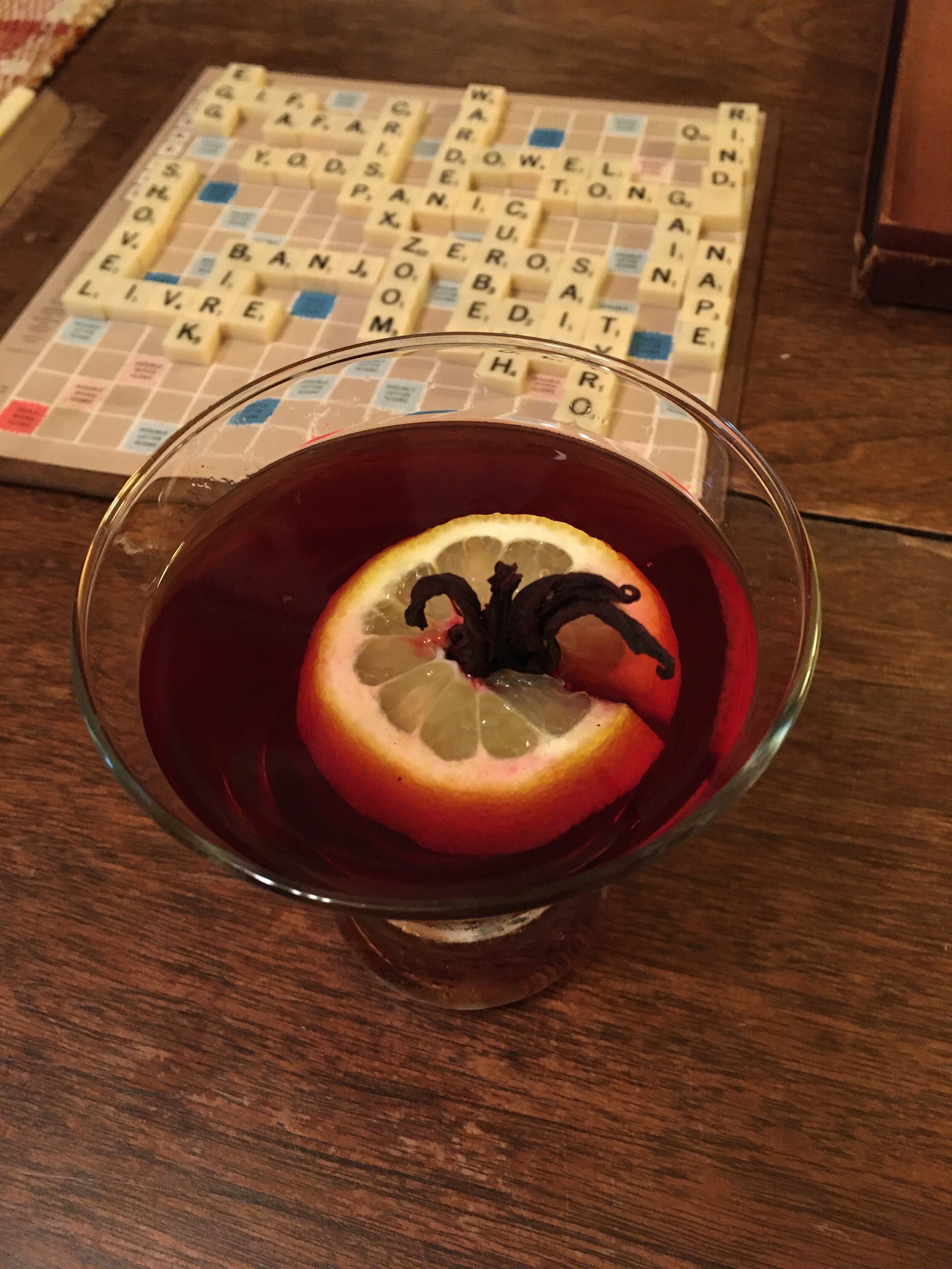
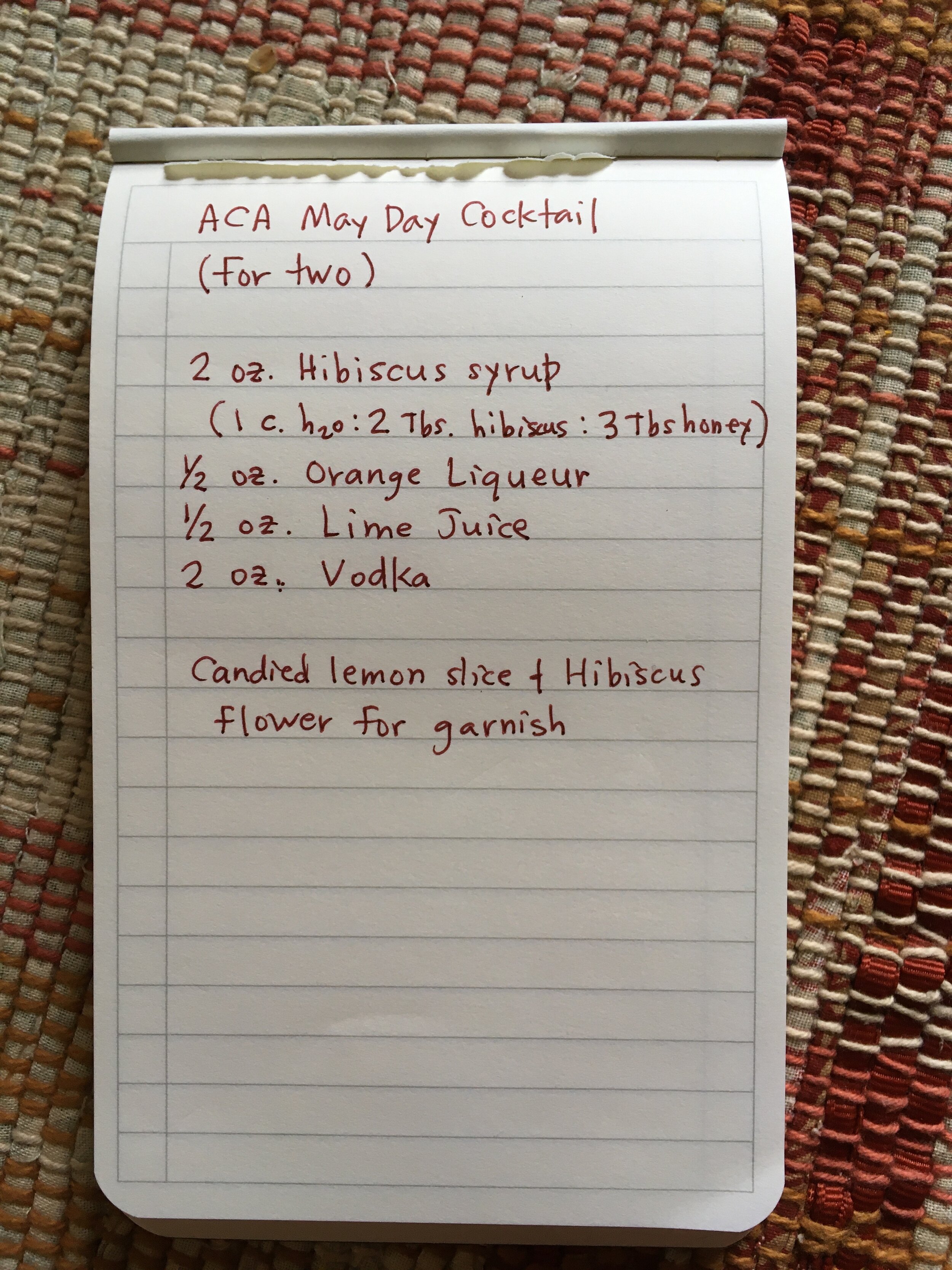
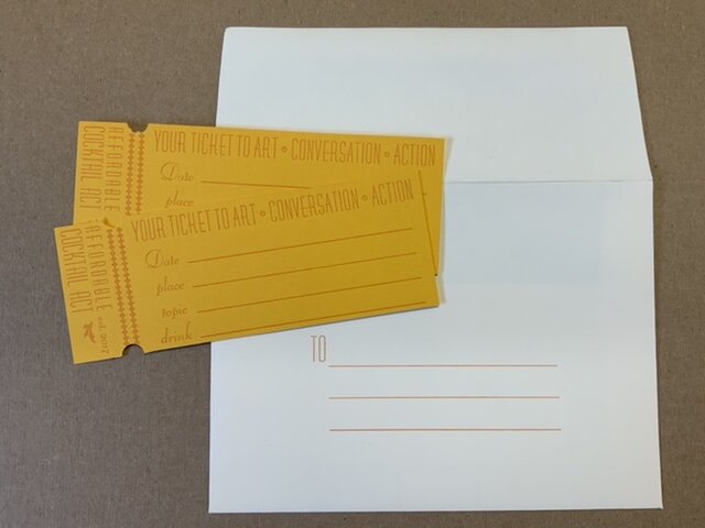
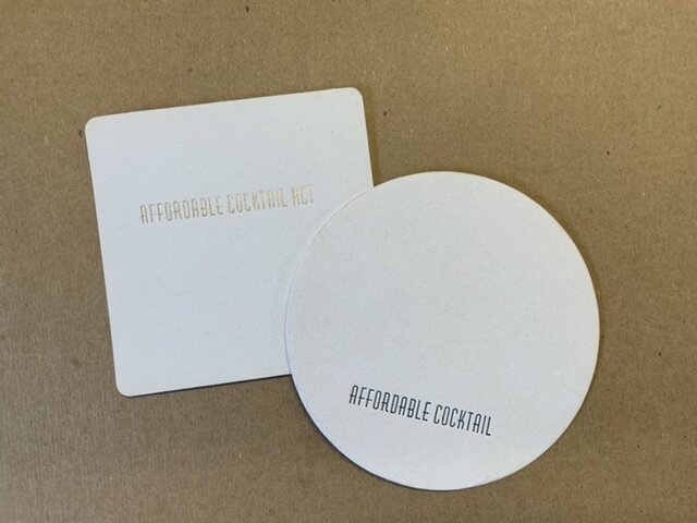
May Day Affordable Cocktail Act
After the 2016 national election, I was pretty frustrated and unsure how to maintain a sense of hope. I think many around me felt the same. We were surprised that Americans voted against democratic progress, compassionate leadership, social infrastructure for more people. We were reminded again that feminist movements over the past two hundred years had helped institute some rights, but that women’s voices are disqualified by men’s. We were reminded that some people are desperate enough to do anything (to anyone) for power—for more money, land, and fame. We were reminded that racism is overwhelmingly systemic in this country. We were surprised that the backlash was quite so mean.
And so, in January of 2017, Donald Trump became the head of the Executive branch of our government. It moved me to march in the streets, buoyed by the company of thousands of other people around the world. The situation also made me want a strong drink (bonus if I could imbibe in the company of smart, sympathetic friends who would make me laugh.) After one such night, mourning the impending loss of affordable health care coverage, the “Affordable Cocktail Act” (ACA) was born. Marilyn Zornado and Barb Tetenbaum have organized many a themed cocktail event, so with their lead, we pulled together a small gathering of artist friends to host a competition and asked them to invent drinks to express the politics of the moment. We mixed and tasted and laughed and shed a few tears as we made drinks like “The No! You’re the Puppet!”, “The Flaming Sinful Cheater” (complete with charred cheetos as garnish), and the “Environmental Deregulation Toddy”. We voted. The winner was “The Pussy Grabber” followed closely by “The Alt-White” and “The Im-peach-mint” cocktails.
Over the last three plus years the ACA has convened occasionally to educate, share resources and advocate on issues important to us, sometimes at each other’s homes, and sometimes at a friend’s bar (thanks, Likewise!). Topics have included land use and conservation, equal rights, climate change, race and immigration, health care, affordable housing and houselessness. We have partially used art as a lens to express and explore politics in our society, looking at other other artists’ work, and letting the issues influence our own approach to navigating this time.
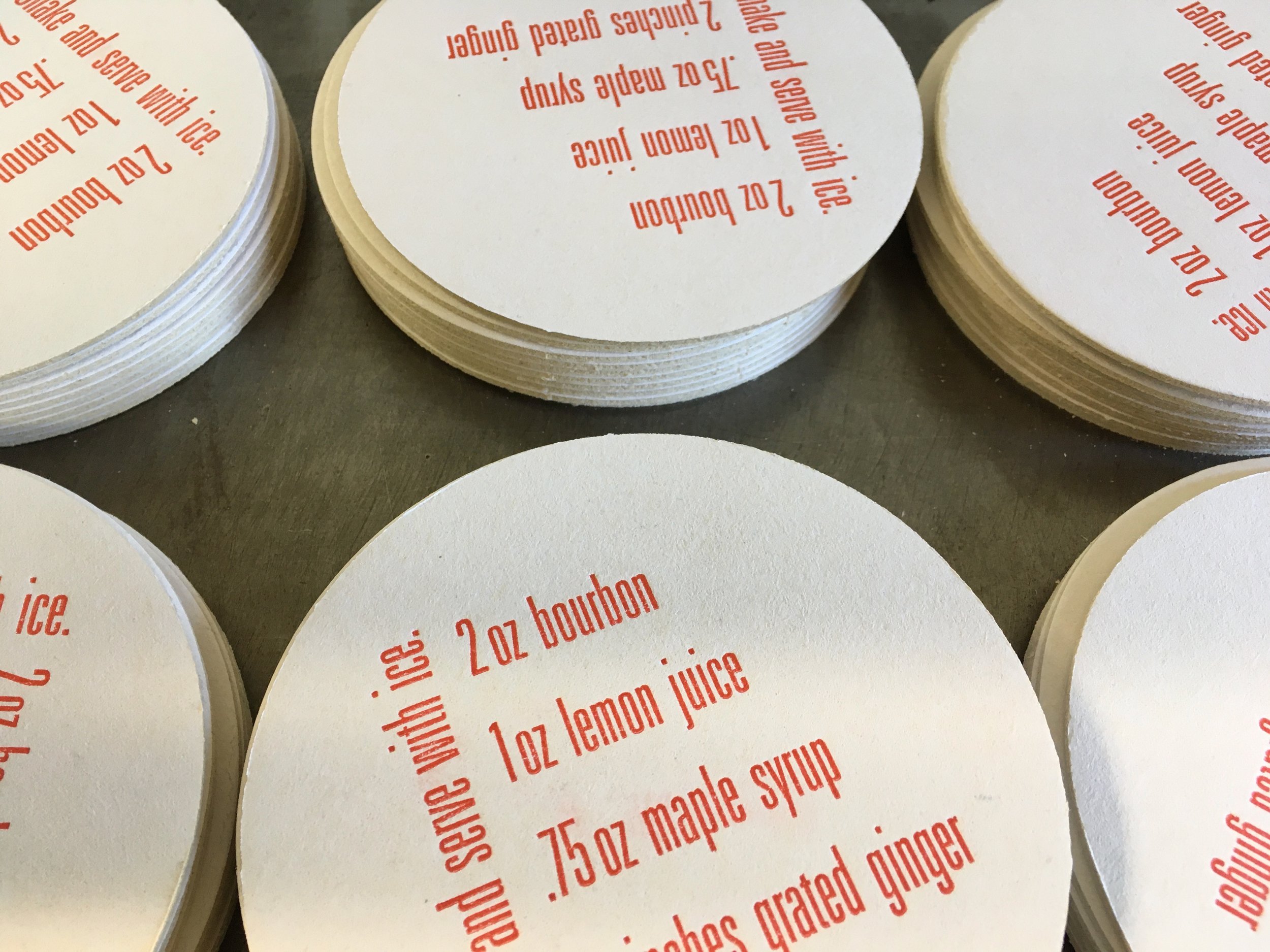
And we have kept up the themed cocktails, but dropped the competition. Our latest get-together was for May Day 2020, which meant we had an online gathering. While our “8 hours for work, 8 for rest, 8 for what you will” were all topsy-turvy, we managed to share some recipes for quarantine drinks and reflect upon what we have found essential during the COVID-19 pandemic. Above is my submission for the occassion.
Despite the often serious nature of the topics, we always manage to have a few good laughs, which is the best medicine against despair that I know.